Sam & Partners SA — Brand Design & Corporate Identity
Two souls, one practice: new brand and website for a real estate and trustee group in Lugano.
- Client
- Sam & Partners SA
- Sector
- Real Estate · Trustee Services
- Market
- CH Ticino
- Year
- 2025, 2026
- Services
- Brand Design & Corporate IdentityUI/UX & Web Development
- Website
- sampartners.ch
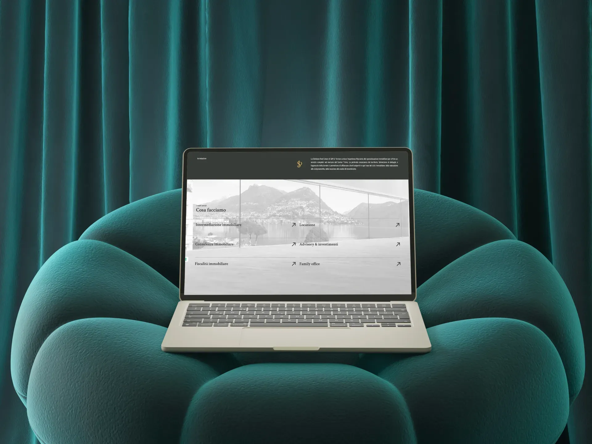
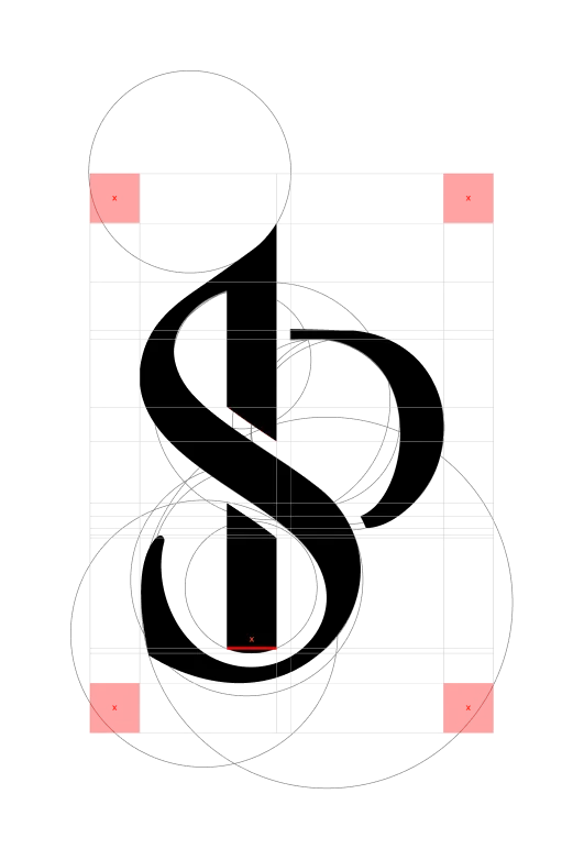
Rebranding and new four-language website for Sam & Partners SA, a Lugano group that brings real estate and trustee services under one practice. A dual brand system, black/white with gold for real estate, burgundy for trustee, Crimson Text and Barlow Condensed typography, complete stationery. Project kicked off in December 2025, live from February/March 2026.
A practice with two souls and a website that barely told one.
Sam & Partners SA is a Lugano group that brings a real estate department and a trustee firm under one roof: five people, a premium clientele of private individuals and companies, work that touches wealth, property and family affairs. The previous site was heavy, dated, hardly professional, and was not up to that positioning. The challenge was to keep the historic brand, Sam & Partners was already active, and to build around it a new visual identity able to represent both souls of the practice without merging them into a compromise or a single generic voice.

Same voice, two accents.
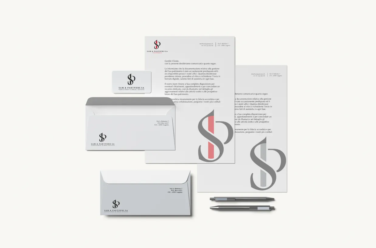
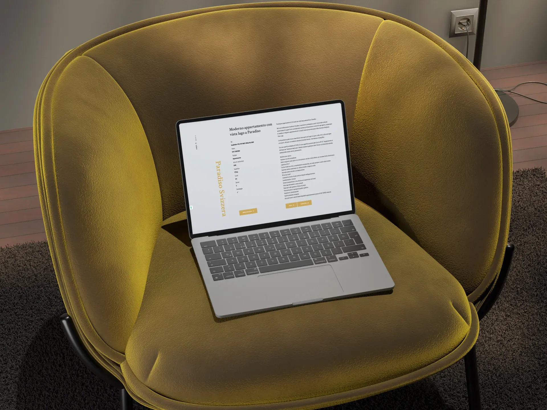
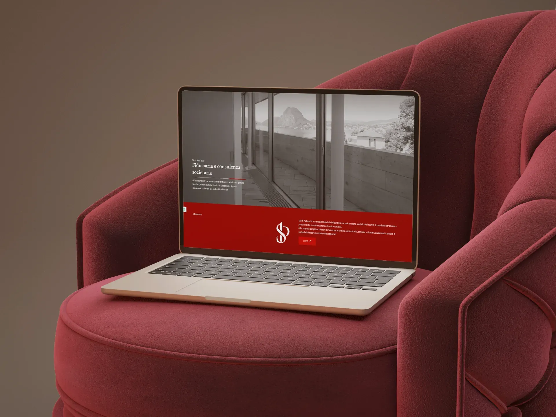
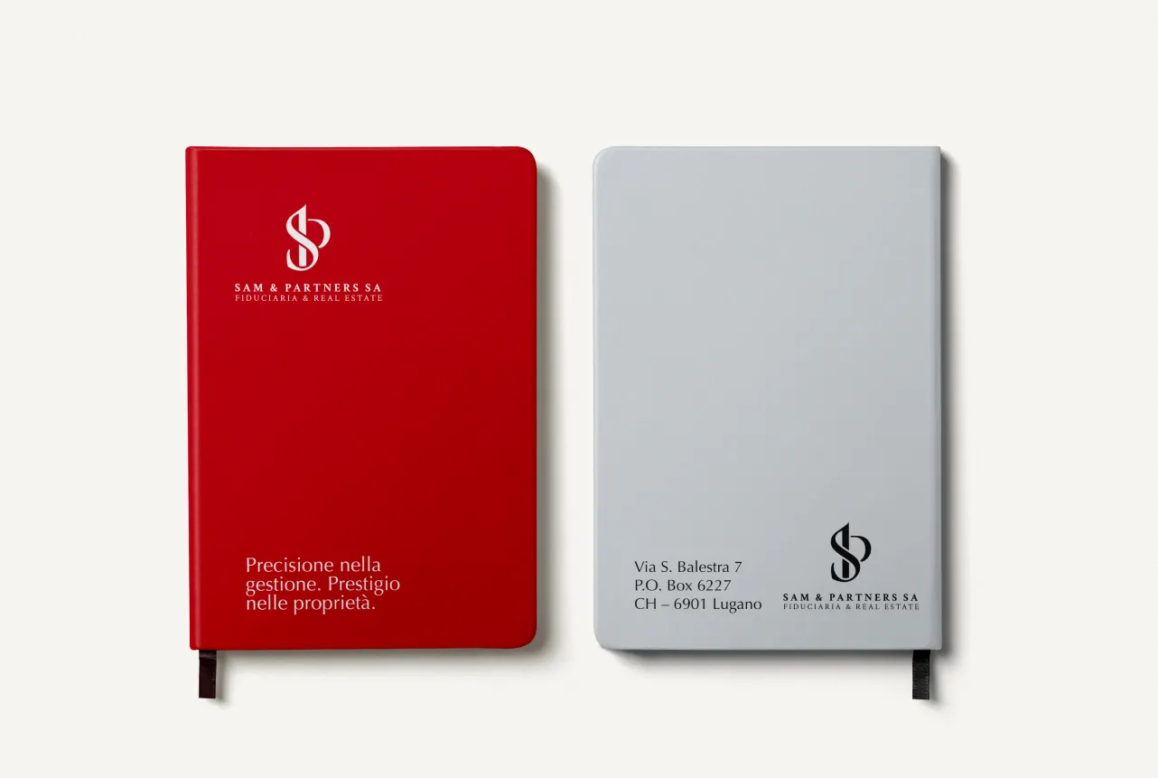
The brand system has a shared black-and-white base and two chromatic accents that separate the departments: gold for real estate, burgundy for trustee services, two recognition codes running across the site, the stationery and the communication materials. Typography follows the same principle: Crimson Text, an editorial serif, for titles and H1; Barlow Condensed, a condensed sans, for body copy and operational layouts. The site starts from a single homepage that introduces the practice and then forks toward the department of interest, with two parallel sections of identical architecture, services, news, team and contacts for both, plus a properties section for sale, purchase and rent on the real estate side. Four languages, Italian, English, German and French; desktop-first with full responsiveness on tablet and mobile; photography of the team and spaces supplied by the group's professional photographer, no stock images. Off the screen, the complete stationery: business cards differentiated by department, letterhead, envelopes, email signature, operational templates, pen and notebook, all set on the same typographic and chromatic system.
Real luxury, in a professional practice, is clarity. Knowing in one second what you're talking about and with whom, even just from the colour of a business card.
Outsmart Team
Fully produced, with one phase still open.
The project kicked off in December 2025. The visual identity, the four-language site and the complete stationery were produced; at the close of the work the site was ready for launch, scheduled between February and March 2026. Extending the system to social channels remains to be evaluated with the practice.
The project in numbers
01How do you design a brand for a practice with multiple departments?
By building a shared base system and introducing distinctive accents for each department. For Sam & Partners SA we used a shared black-and-white structure, with gold as accent for real estate and burgundy for trustee services. Two recognisable visual codes living under the same brand roof.
02Why should a trustee and real estate practice have a four-language website?
Because the clientele of a premium group in Lugano is multilingual by nature: private individuals and companies operating between Ticino, German- and French-speaking Switzerland and international markets. Italian, English, German and French cover the main client profiles and turn the site into an operational tool, not just a showcase.
03How long does rebranding plus the site of a professional practice take?
For Sam & Partners SA the project started in December 2025 and goes live between February and March 2026: about three months from kick-off to launch, covering new visual identity, four-language website and complete stationery. The typical range for projects of this scope is 3-5 months.
04What does the stationery of a premium practice include?
For Sam & Partners we designed business cards differentiated by department, letterhead, email signature and operational templates consistent with the brand system. All materials respect the dual colour palette and the Crimson Text + Barlow Condensed typographic system.
See the project live
Discover more projects
All projects
FCTSA, Federazione Cantonale Ticinese Servizi Autoambulanza
Dream Project Solution