Sabine Andrey — Brand Design & Corporate Identity
Brand identity and website for an architecture studio in Ticino.
- Client
- Studio Sabine Andrey
- Sector
- Architecture · Professional Practice
- Market
- CH Ticino
- Year
- 2026
- Services
- Brand Design & Corporate IdentityUI/UX & Web Development
- Website
- sabineandrey.ch
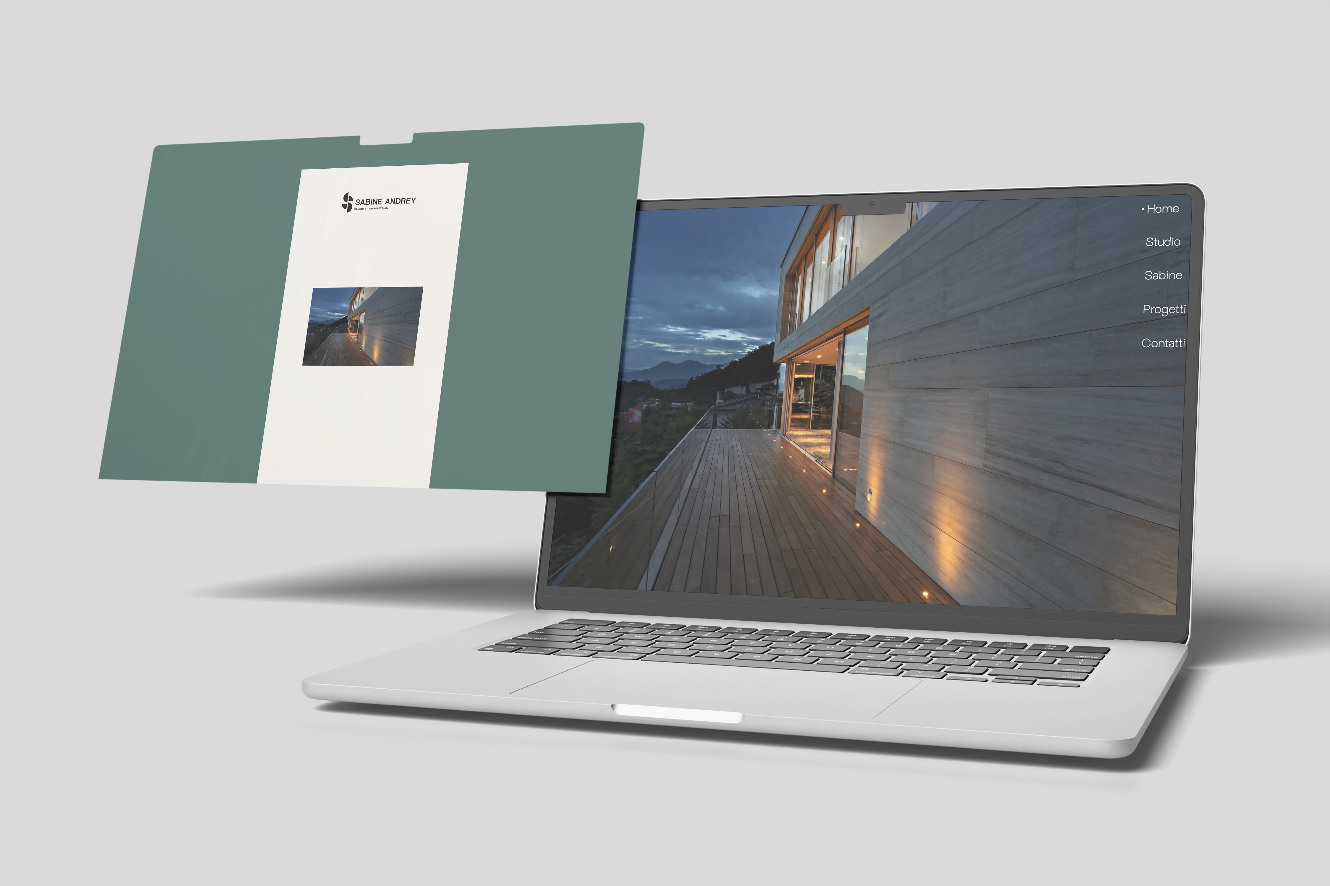
Full visual identity and website for Studio Sabine Andrey, an architecture practice in Ticino specialising in residential projects for private clients and families. A clean, Swiss brand system, geometric logo, cream and green palette, Arena Uno typography, applied to a multilingual website, letterhead, A4 invoices, a cube-shaped illuminated sign, tote bag and pattern. From brief to delivery in two months.
An architect with no online presence, in a market that starts on the web.
Sabine Andrey is an independent architect running her own practice in Ticino: residential design for private clients and families, with a sensibility that looks to minimalist and brutalist architecture, clean forms and honest materials, and clients who arrive through word of mouth. Online, though, nothing existed: no website, no coordinated image, no visual system conveying the studio's stylistic signature, in a market where private clients search, compare and assess before entrusting their home to a professional. She asked us to build from scratch an identity worthy of the work.

From the A4 sheet to the cube above the door.
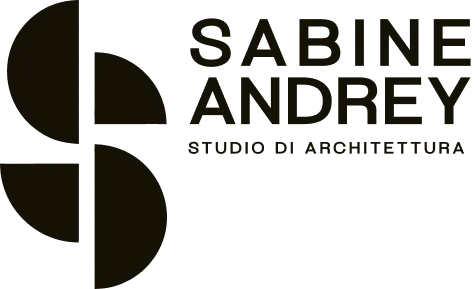
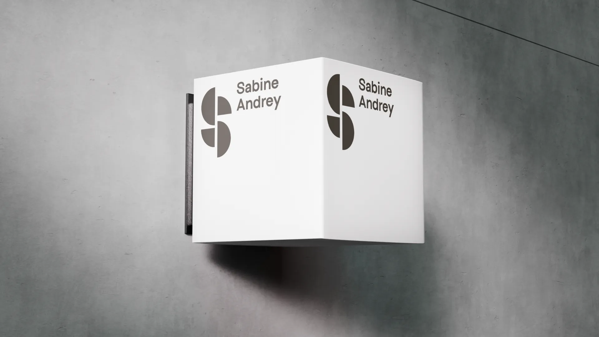
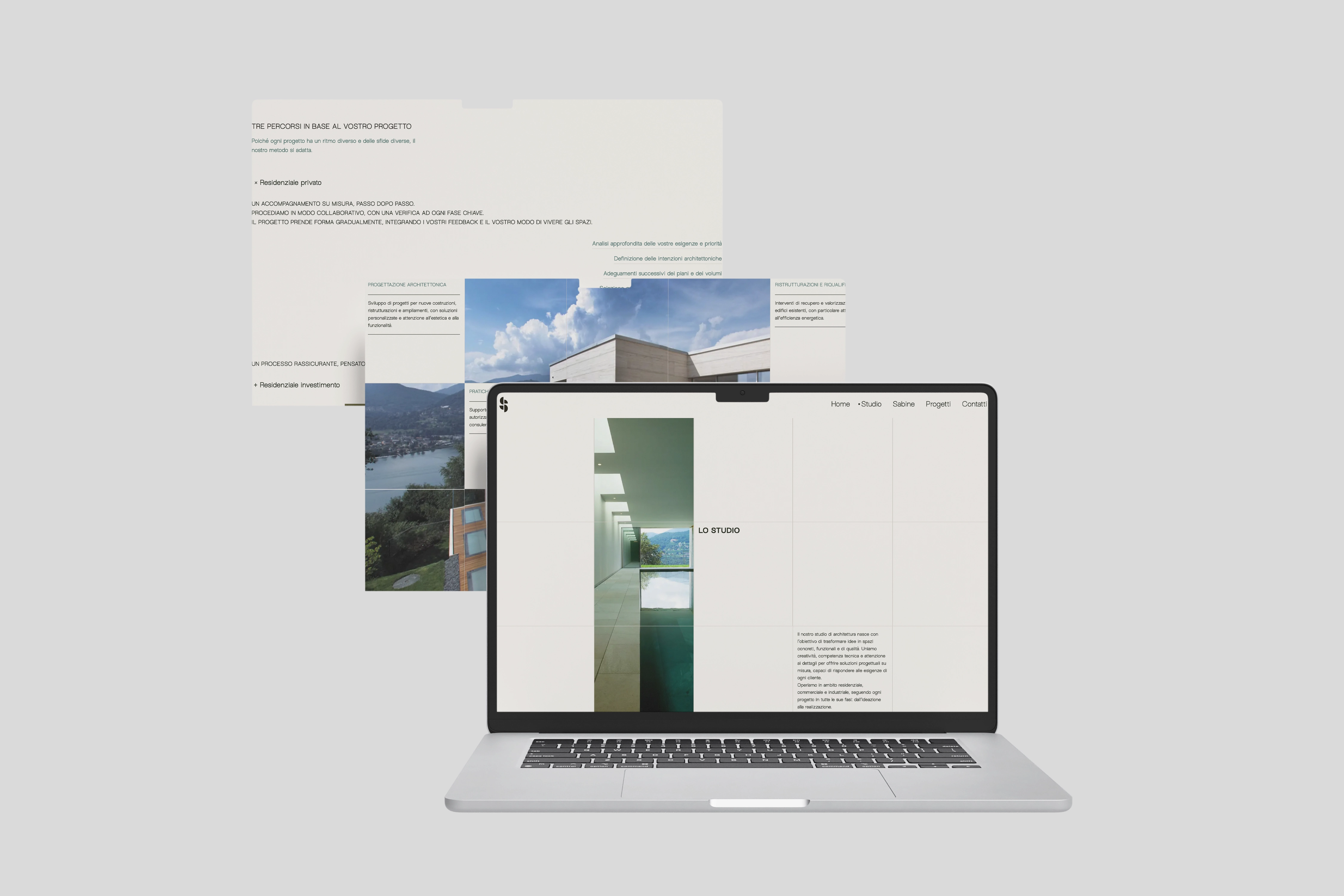
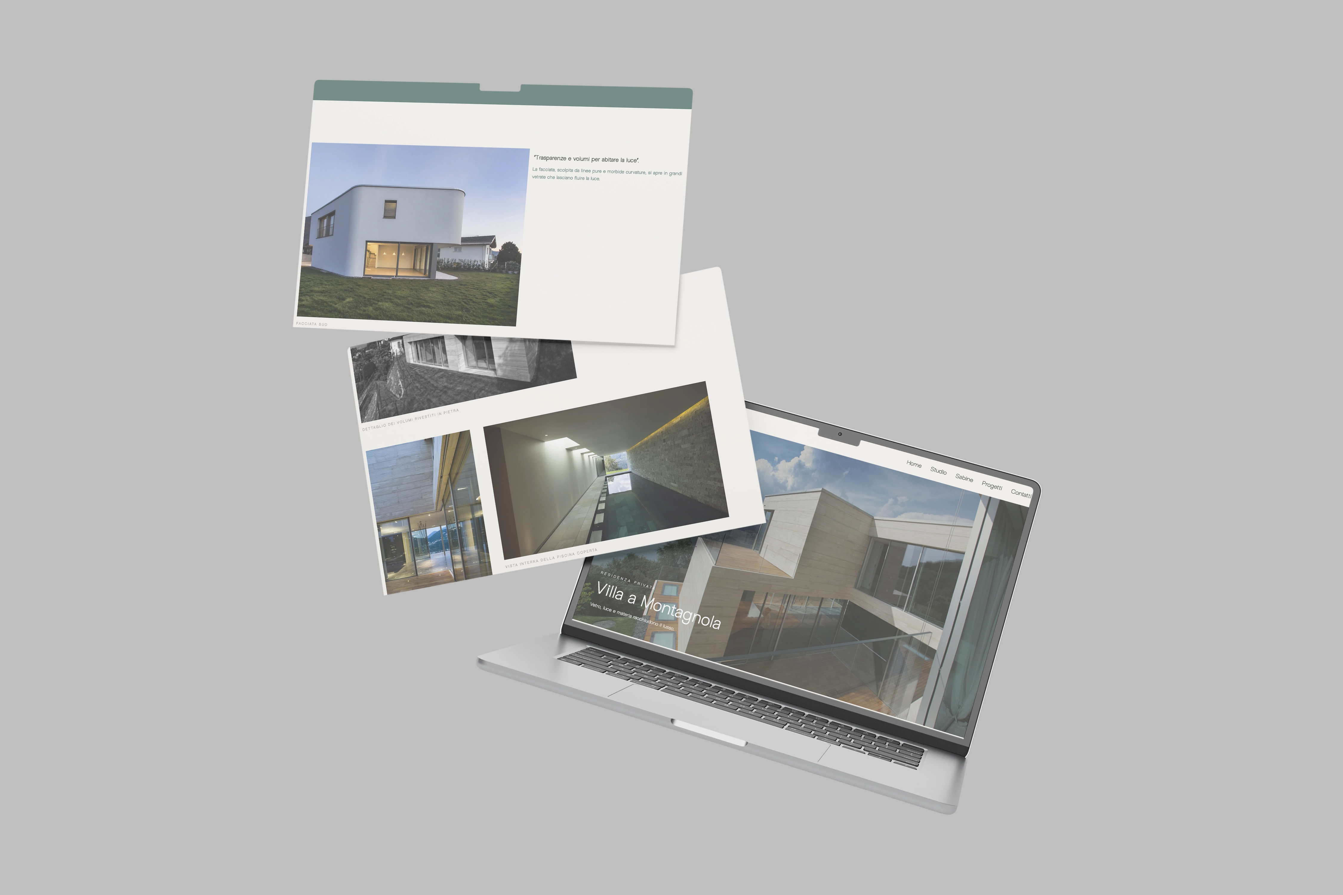
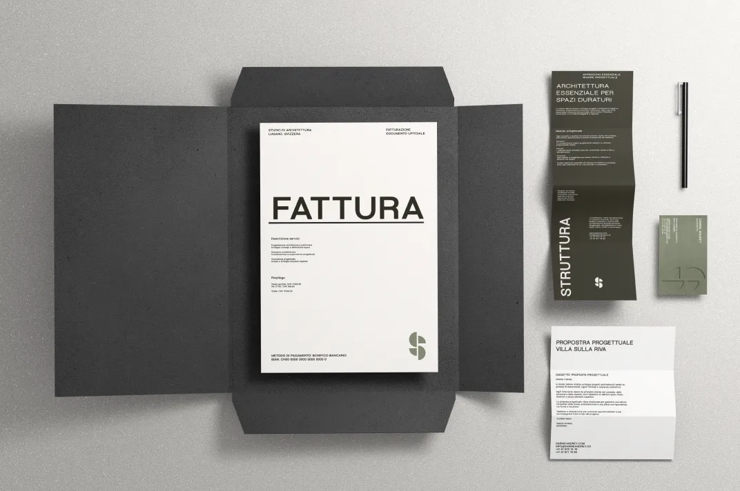
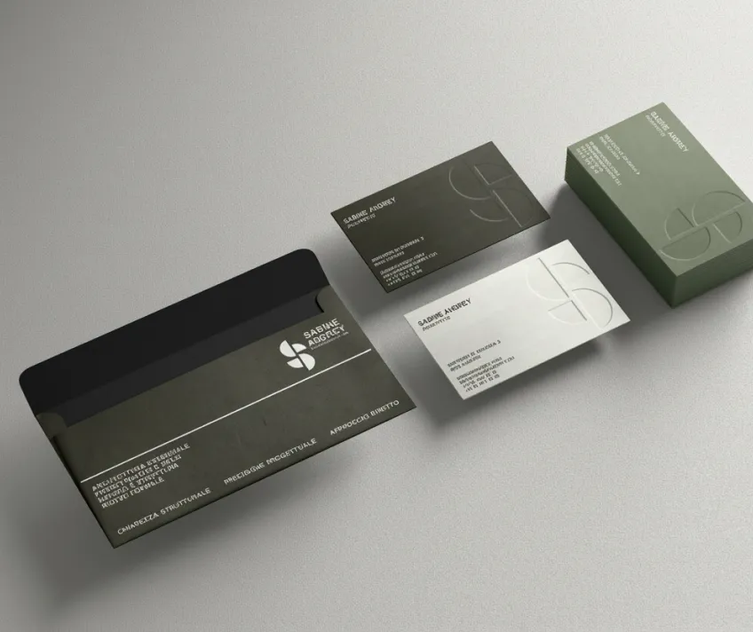
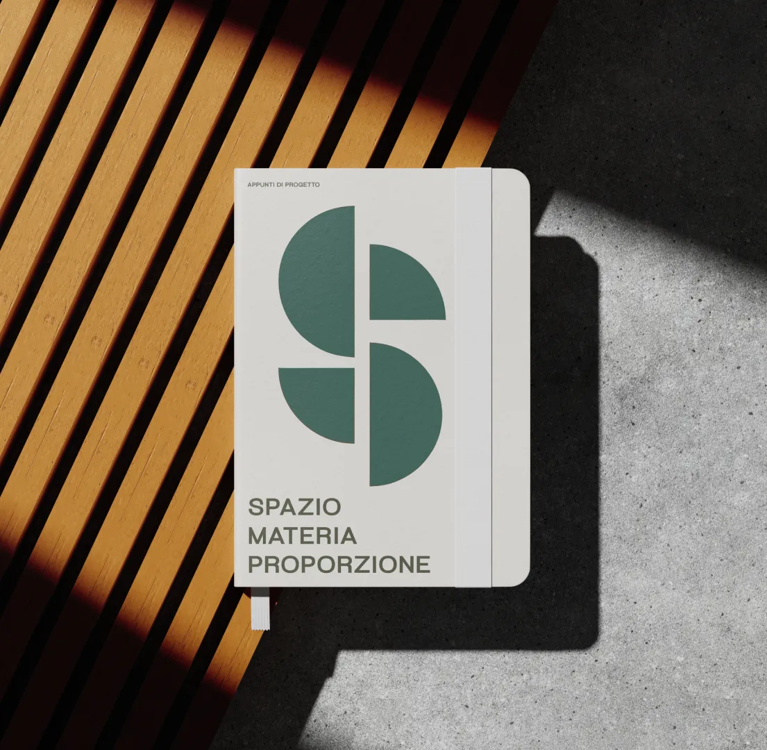
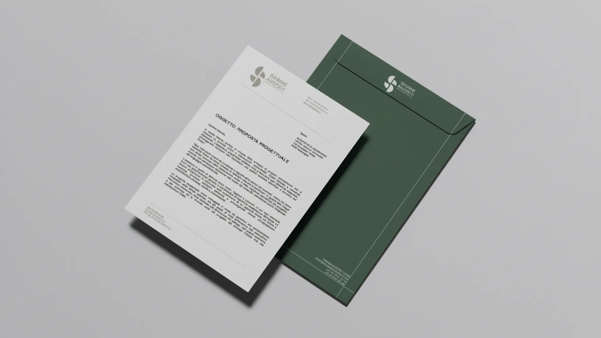
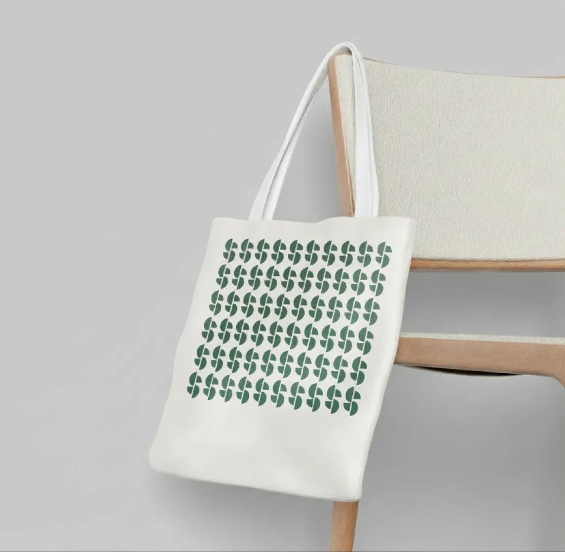
The logo is an S broken into four geometric parts, scalable from the 16-pixel favicon to the sign above the entrance, with a primary uppercase version and a variant for secondary applications. Around it, a neutral cream as primary colour and supporting greens; for typography a single font, Arena Uno, worked in hierarchy across every application. The brand book gathers the logo and its applications, usage rules, palette, typography and mockups on every touchpoint. The site has five areas, home, about, projects, project detail and contacts, in Italian and English, desktop-first and responsive on tablet and mobile, with project photography at the centre. The identity then moved onto the studio's operational materials: A4 letterhead and a coordinated invoice template, business card, branded notebook, an illuminated cube sign suspended above the entrance, a tote bag and a custom pattern applied to the tote and designed as a modular element, extendable to packaging, courtesy materials and future touchpoints. From brief to delivery, about two months.
An architecture brand isn't described: it's built. We worked with Sabine the way you work on a project, one detail at a time, with no superfluous elements.
Outsmart Team
The system is delivered.
There is a complete identity documented in the brand book, the bilingual website across its five areas, the stationery, the finalised sign and the supporting materials. The pattern remains available for packaging, courtesy materials and future touchpoints.
The project in numbers
01What does the brand identity of an architecture practice include?
Logo and its variations, colour palette, typographic system, brand book with usage rules, application mockups and patterns. For Studio Sabine Andrey we built a complete system: geometric logo based on an S split into four parts, cream and green palette, Arena Uno typography, an operational brand book.
02Why should an independent architect have a coordinated visual identity?
Because in a market where private clients compare practices even before contacting them, a coordinated image communicates professional rigour before any word. An architect who takes care of their own brand suggests how they will take care of the client's home project.
03Should an architecture practice's website be multilingual?
In Ticino, yes. The region attracts international clients and an Italian-English version opens up a much wider audience. The Studio Sabine Andrey site is designed from the start as bilingual, with a desktop-first structure and full responsiveness.
04How long does a full brand identity plus website take?
The project for Studio Sabine Andrey, brand identity, bilingual site, stationery, sign and supporting materials, was delivered in about two months. A timeline balanced between operational efficiency and attention to detail, with no shortcuts on the brand system or revisions.
Find out more about the client