Sport Angels — Brand Design & Corporate Identity
Logo soft restyling, new identity and website for private protection in the mountains.
- Client
- Sport Angels
- Sector
- Private protection · Sport and concierge
- Market
- CH St. Moritz
- Year
- 2026
- Services
- Brand Design & Corporate IdentityUI/UX & Web Development
- Website
- sportangels.ch
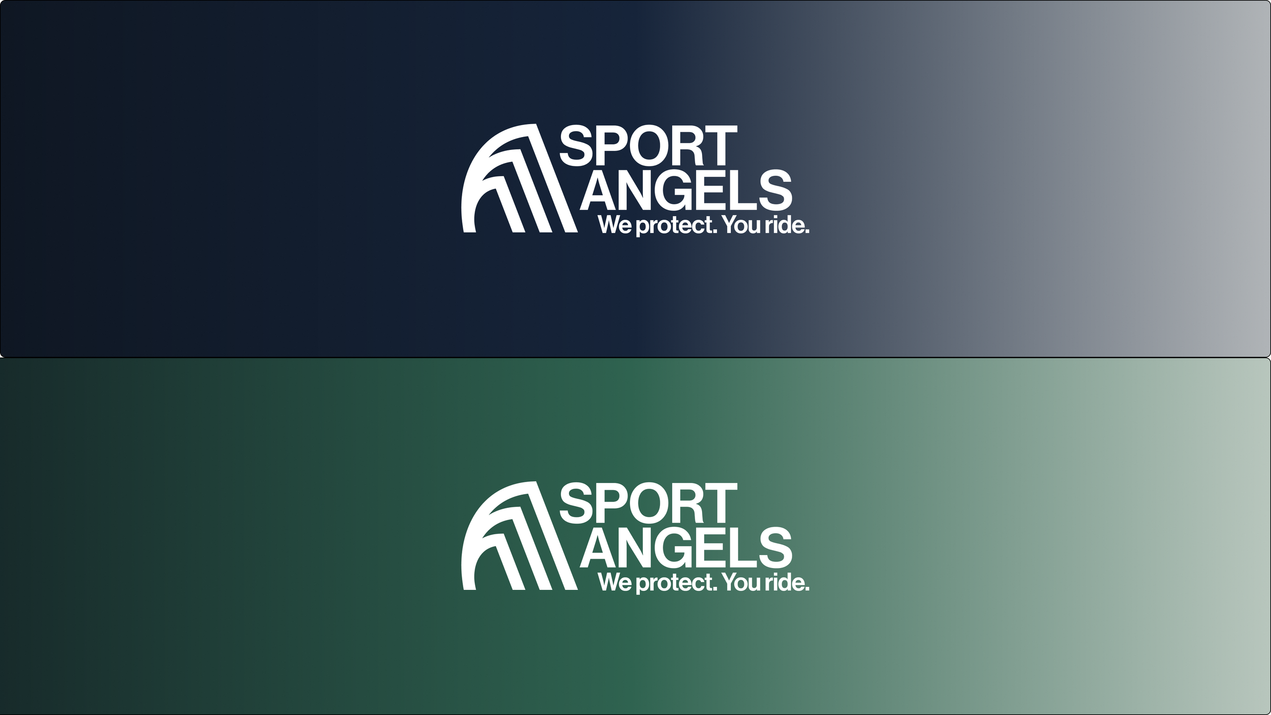
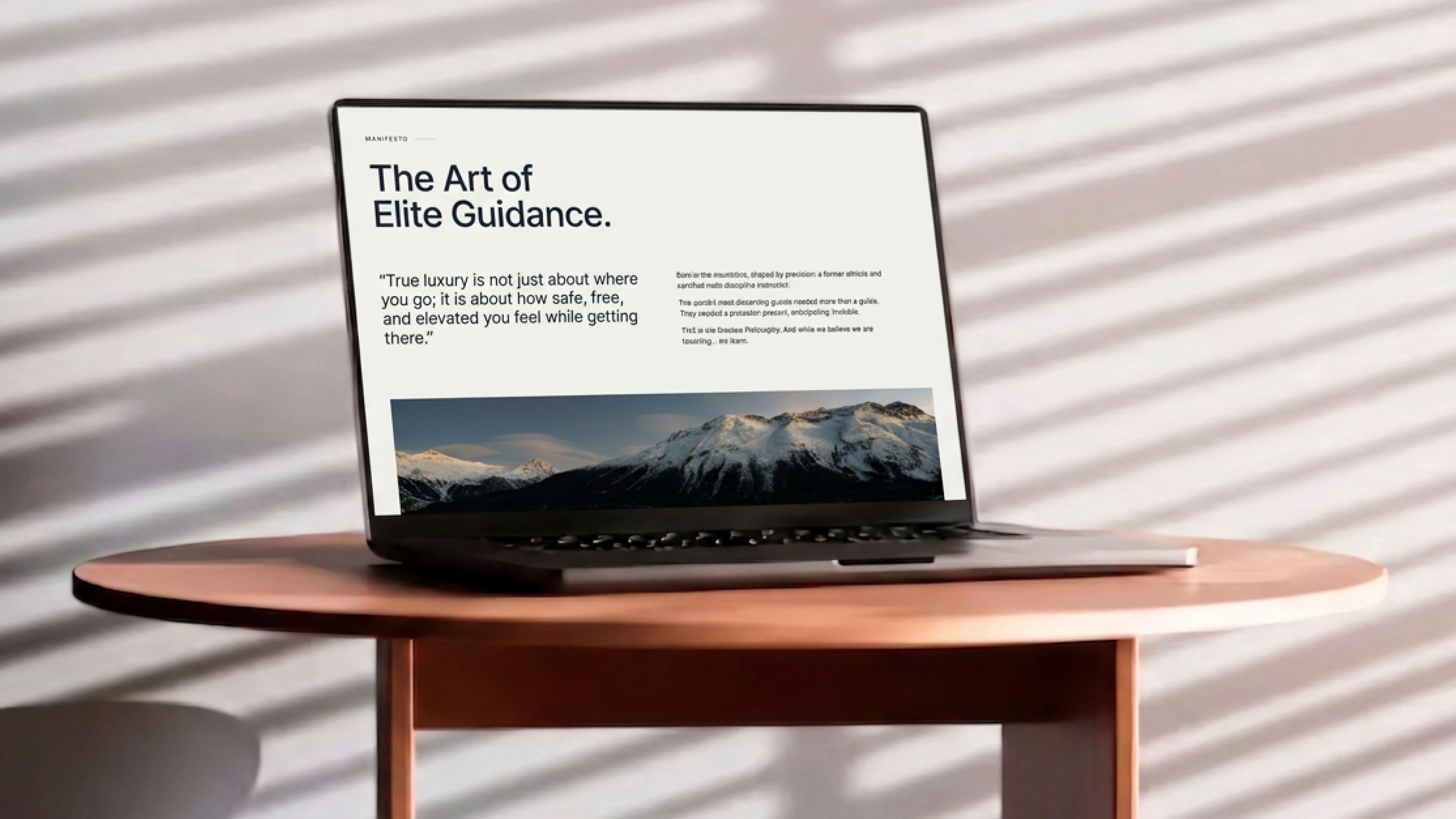
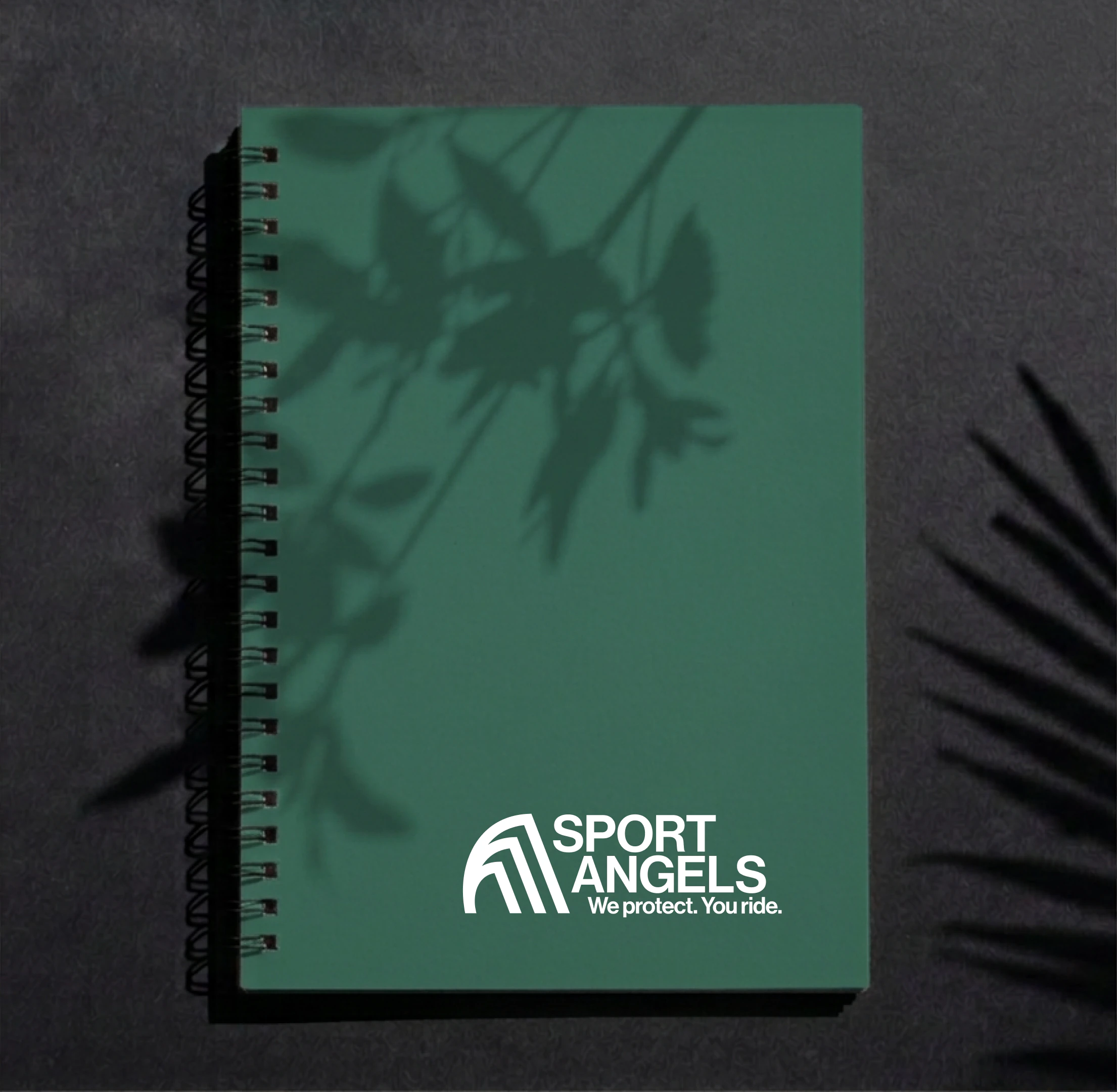
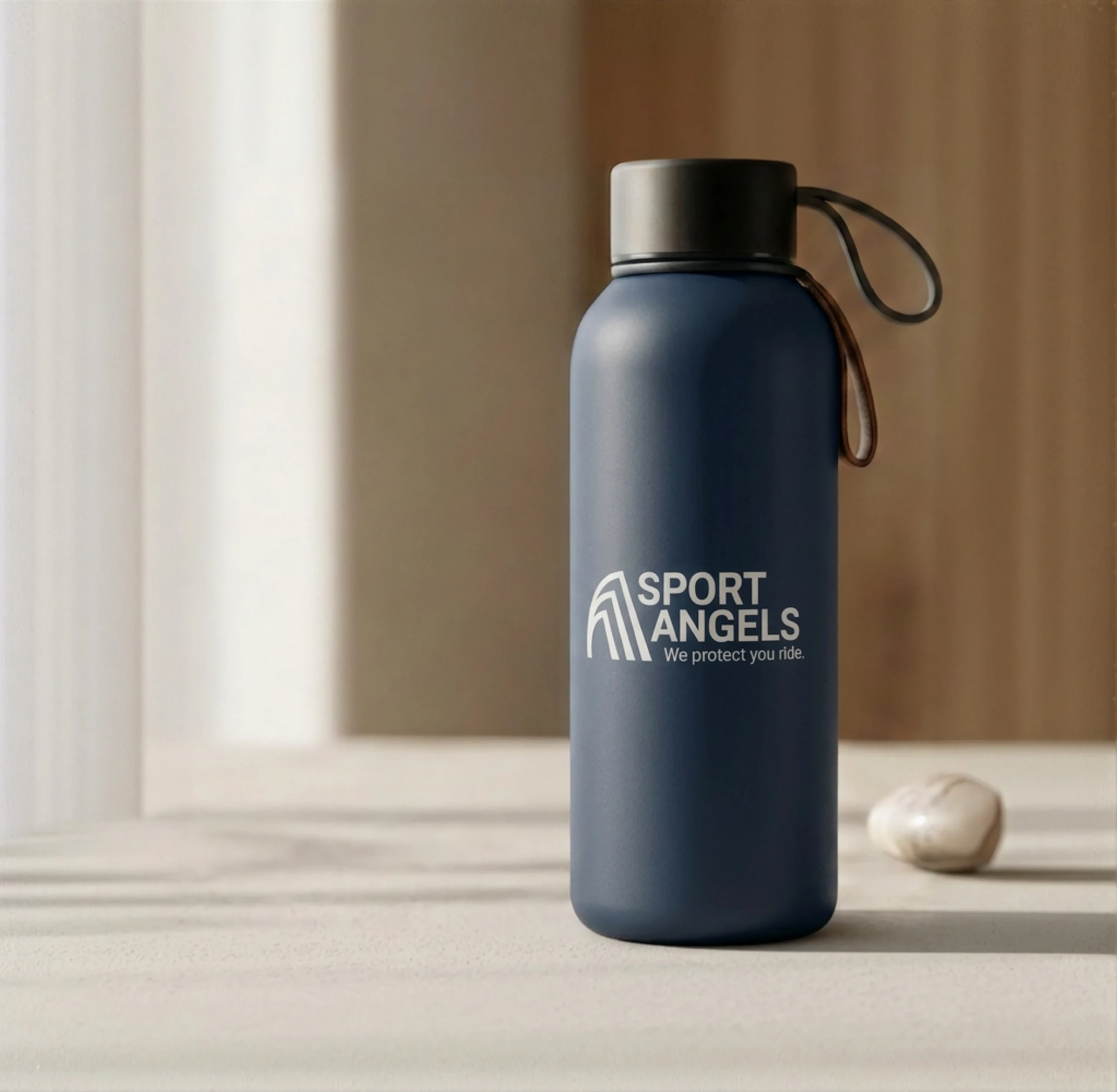
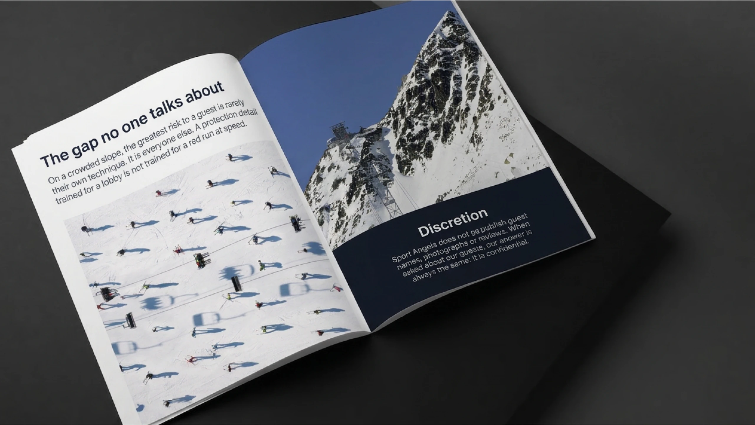
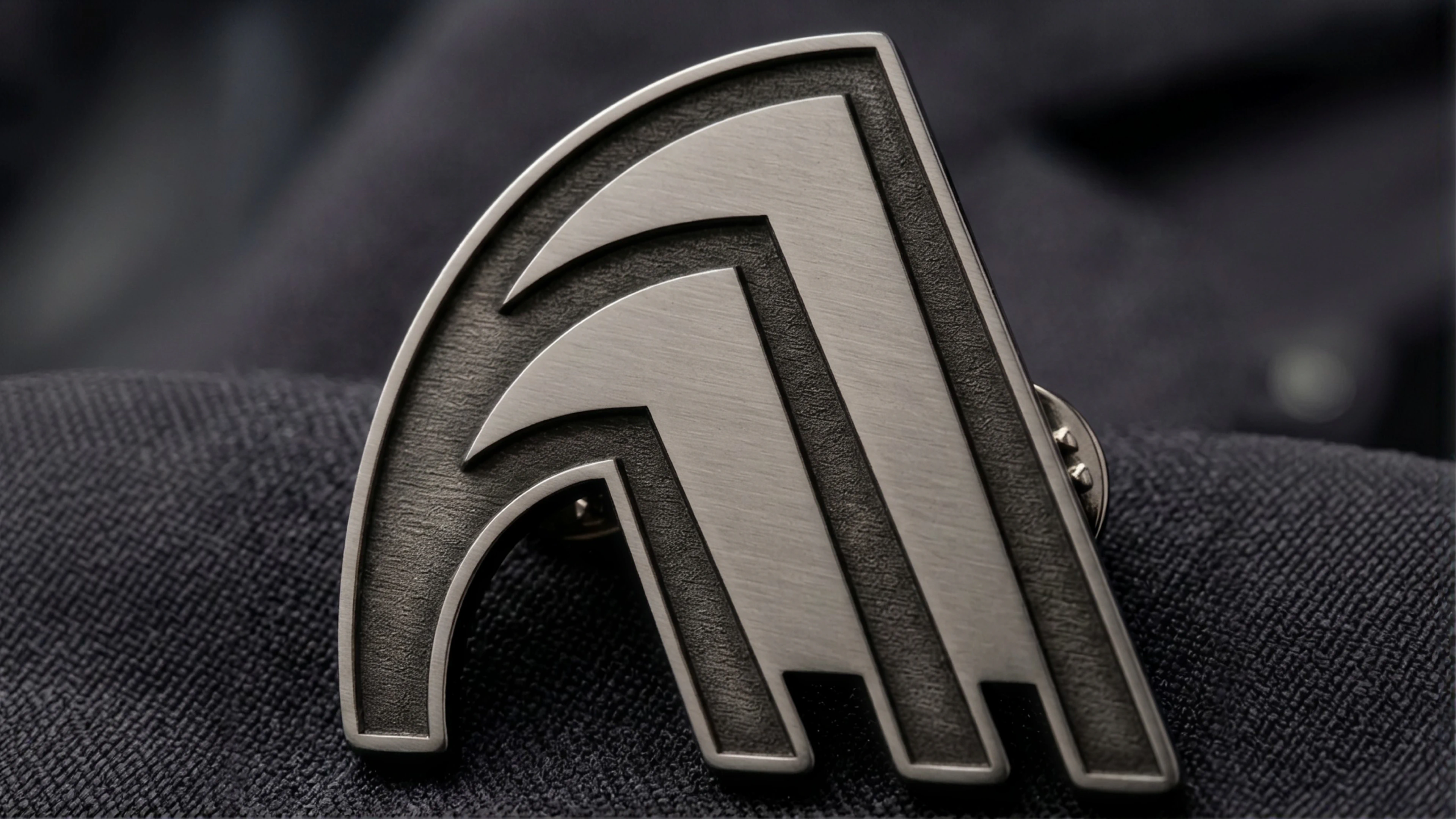
Logo soft restyling, new brand identity and website for Sport Angels, a private protection, elite sport guidance and concierge service based in St. Moritz. The old wing straightens into an arch, gold and black give way to Bernina Navy and Engadin Fir, with a single typeface, Neue Haas Grotesk. The mark lives on business cards, brochure, notebook, bottle and pin, and on a website you move through like a descent: few words, a lot of mountain, one message to begin.
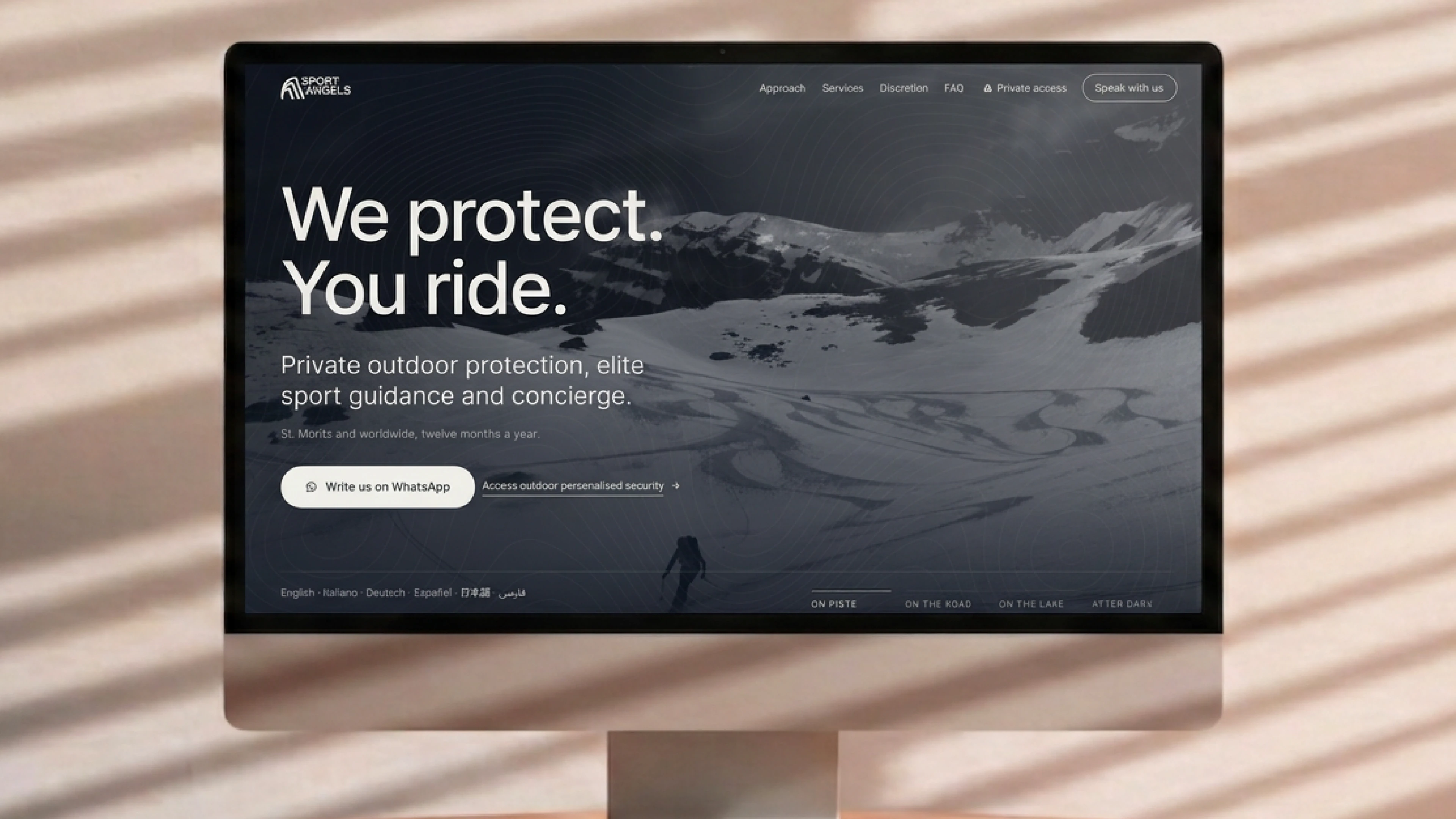
A strong mark, in the wrong register for a service built on discretion.
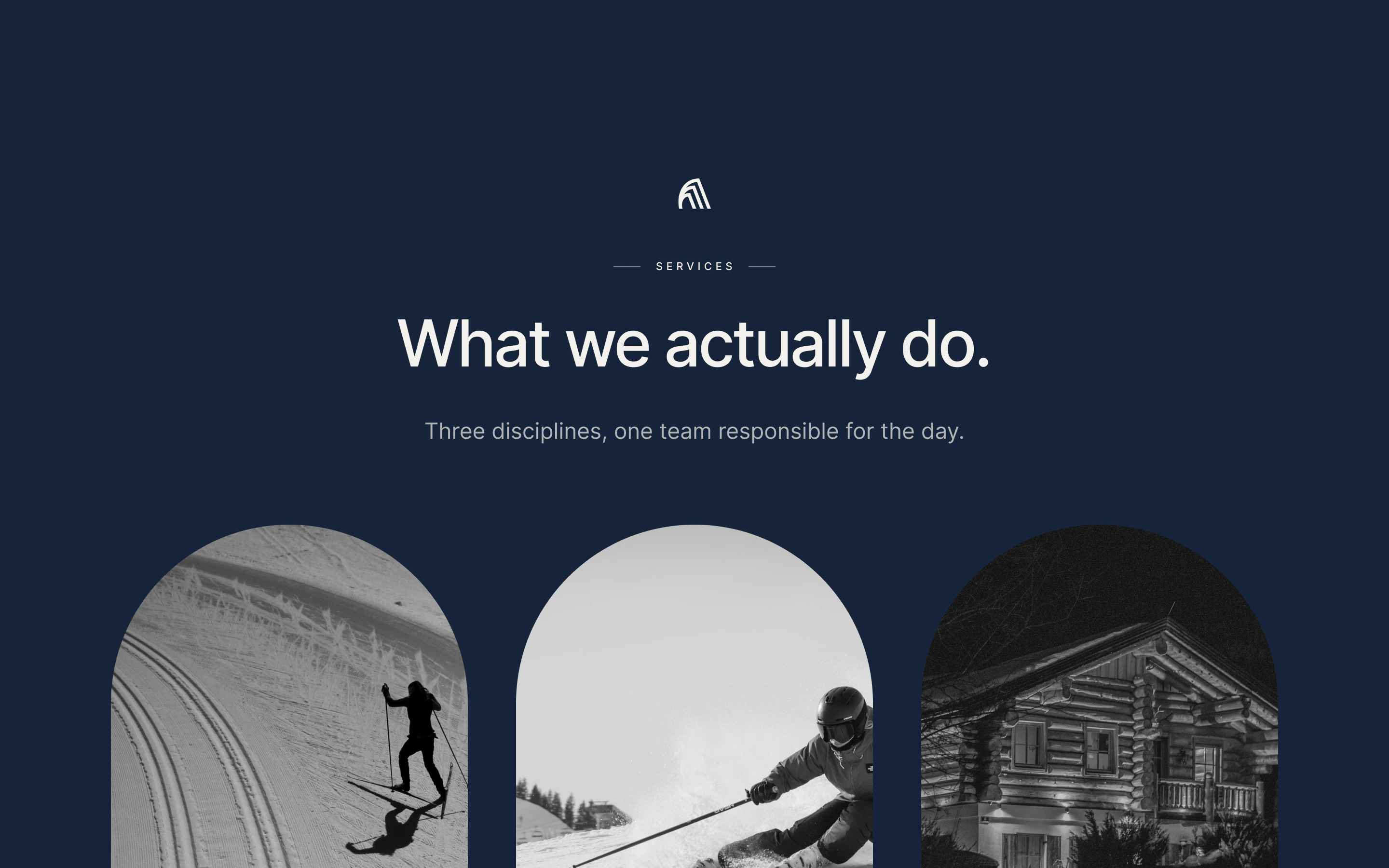
Sport Angels is a private protection, elite sport guidance and concierge service based in St. Moritz, active twelve months a year: skiing, snowboarding and freeride in winter, cycling, sailing and trekking in summer. It accompanies very private guests, families and public figures, for whom a day in the mountains without incident is not luck but work done beforehand: snow, weather and crowds on the slopes read hours ahead. The existing mark, a black three-stroke wing laid horizontally next to the name, was strong and recognisable, but it spoke of speed and force, and the system around it, black and gold, looked more to the institution than to the mountain. For a service that promises to be there without being noticed, the register was wrong.


An arch in place of the wing, the mountain in place of gold.
The restyling is soft: the three strokes of the old mark stay, but they straighten and close into an arch, halfway between a wing and a mountain profile. The mark becomes quieter, stands on its own as an icon, on the pin and on the back of the business card, and repeats as a pattern. The logo comes in five colourways, with the tagline We protect. You ride. next to the name.
The palette leaves gold and black for two colours taken from the territory: Bernina Navy, the blue of shadow on snow, and Engadin Fir, the green of summer firs. Glacier Snow and Snow White act as surfaces, Ink carries text where contrast is needed, and every pairing is checked so it reads well everywhere. A single typeface, Neue Haas Grotesk, born in Switzerland and the origin of Helvetica: neutral on purpose, so that what stays are the words, not the way they are written. Everything is gathered in the brand book.
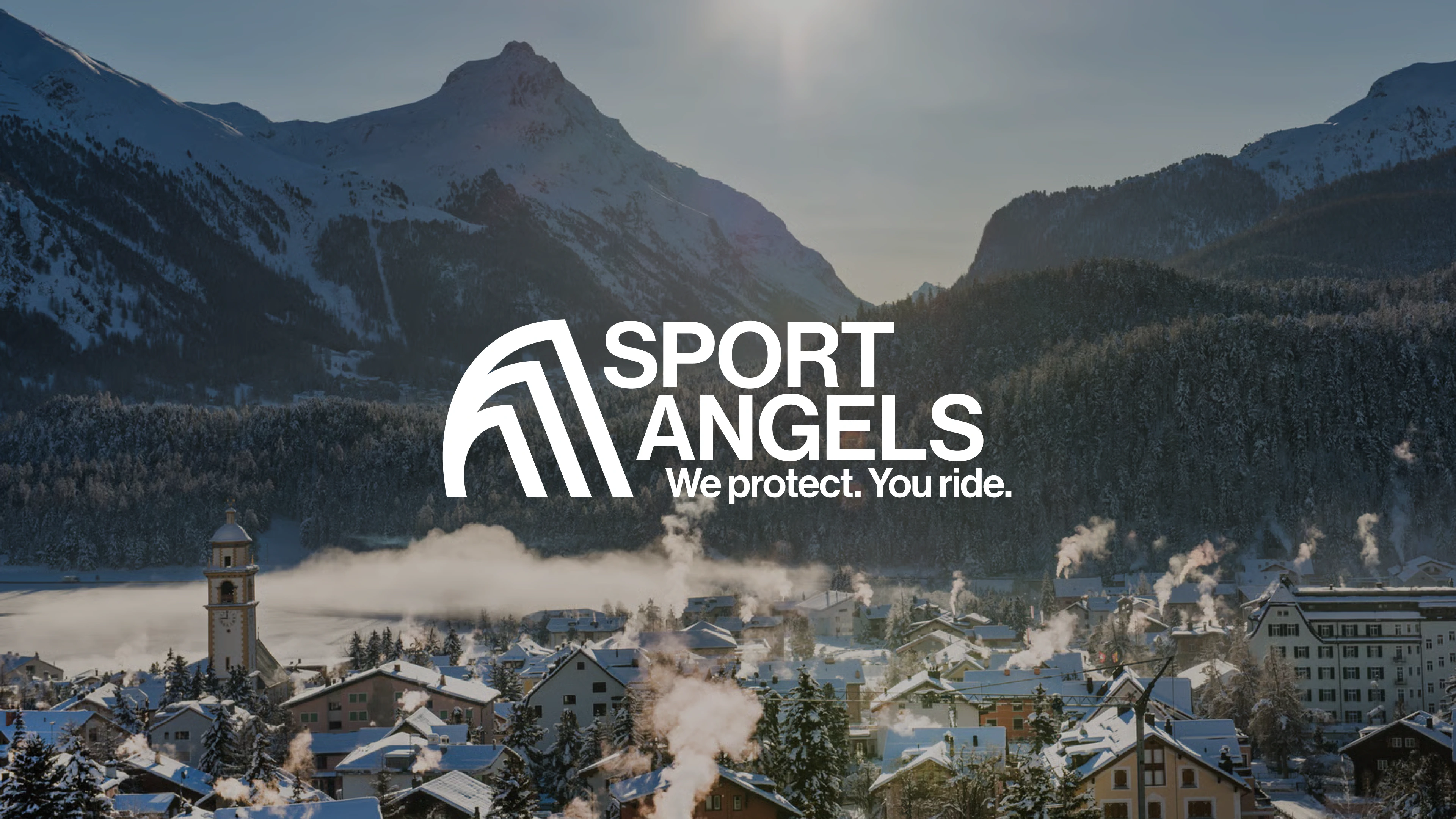

A website you move through like a descent.
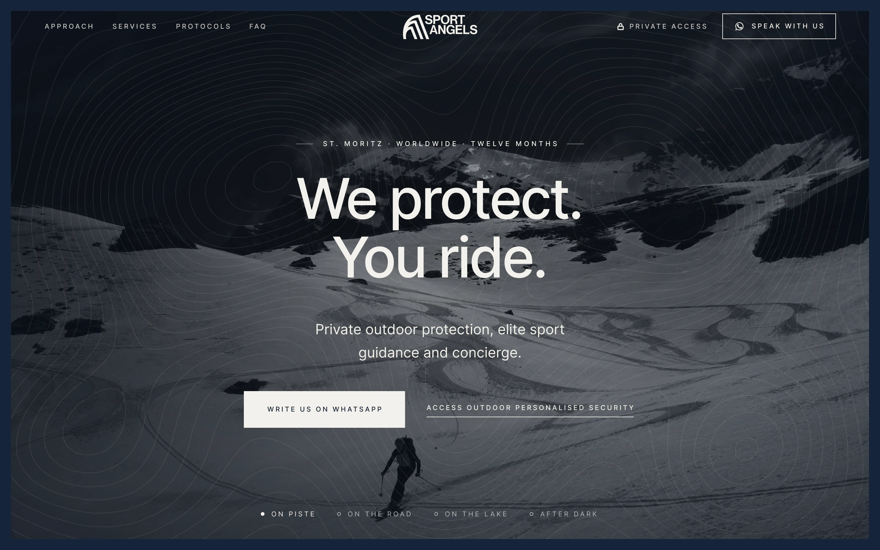
It opens on a black-and-white mountain and a single line: We protect. You ride. Then the page goes down slowly, like a day on the snow. It tells of the risk no one talks about, a crowded slope where the danger is everyone else, and of the shadow philosophy: be there, anticipate, stay unseen. There are winter and summer, the rules of discretion, an archive photo of the founder's mother, who taught skiing in the 1950s.
At the bottom there is no form to fill in: you write on WhatsApp and the technical direction answers directly, in six languages. Those who have already spoken with Sport Angels receive a key to the private area, where they find the founder's full profile.
A service that sells discretion can't have a mark that raises its voice. We took out noise, not character.
Outsmart Team
Identity delivered, website online.
The brand book gathers logo, palette, typography, usage rules and mockups. The website is online, on desktop and mobile, with its private area.
The project in numbers
01What is a logo soft restyling?
It is an intervention that keeps a mark's recognisable elements and corrects its tone, instead of designing a new one from scratch. For Sport Angels the three strokes of the old mark stayed: we straightened them into an arch, quieter and more legible on its own, as an icon.
02How do you choose the palette for a premium service brand?
By starting from what the colour must say before any word. For Sport Angels gold and black spoke of luxury and of the institution; Bernina Navy and Engadin Fir speak of competence and of the mountain. Every text pairing is checked against WCAG 2.1 and APCA, so the palette stays legible on every medium.
03Why a website without a contact form?
Because those who turn to Sport Angels don't want to leave data behind. Contact happens on WhatsApp, directly with the technical direction, and the site states that nothing is kept beyond what is needed to reply. Discretion is part of the service, and so of the interface.
04What is a private area for on the website of a confidential service?
To show credentials only to those who need to see them. The founder's full profile and certifications open with a key, after a first conversation: the public site stays essential and trust is built in private.
See the project live