Fidatly SA — Brand Design & Corporate Identity
Soft restyling and new website for a cleaning services platform between Ticino and northern Italy.
- Client
- Fidatly
- Sector
- Facility Management · Cleaning Services
- Market
- CH Ticino
- Year
- 2025
- Services
- Brand Design & Corporate IdentityUI/UX & Web DevelopmentAdvertising, Marketing & Strategy
- Website
- fidatly.com
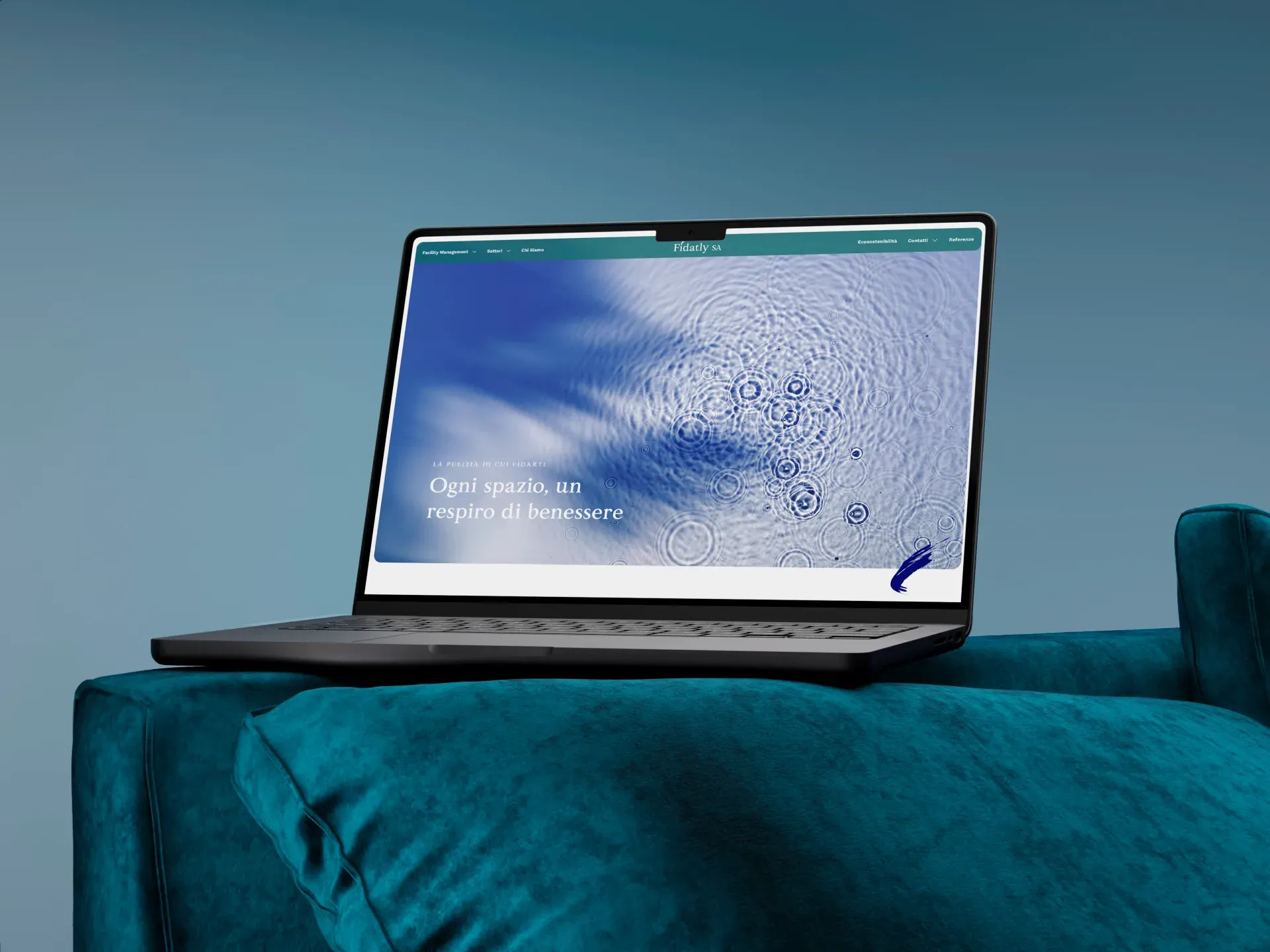
Brand soft restyling and new website for Fidatly, a cleaning services platform based in Chiasso serving companies and private clients between Ticino and northern Italy. A midnight-blue and bright-blue palette replacing the muddy greys, redesigned UI/UX across six areas, SEO set on local and cross-border keywords. A more visible, more approachable, more locally ready brand.
A confused site for a service built on trust.
Fidatly is a cleaning services platform based in Chiasso: it operates mainly B2B, offices, companies, facility management, with a smaller private clientele, across a cross-border geography between Ticino and northern Italy. A service that by its nature sells on trust, because the client hands the supplier daily access to their spaces. The brand existed, the logo existed, the site existed, but they were old and confusing: muddy greys that communicated anything but cleanliness, heavy layouts, content that was hard to navigate, for a company that sells order and freshness. The goal was to make Fidatly more present locally and more approachable to new clients, without disrupting an identity that already worked in its structural elements: refresh, not rewrite.
Surgical restyling, not full rebranding.
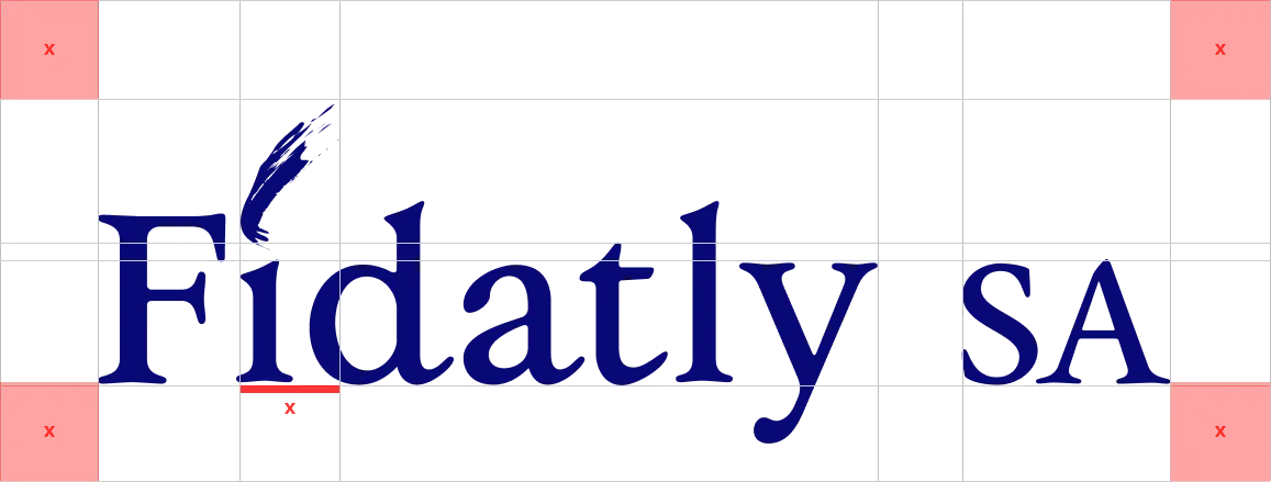
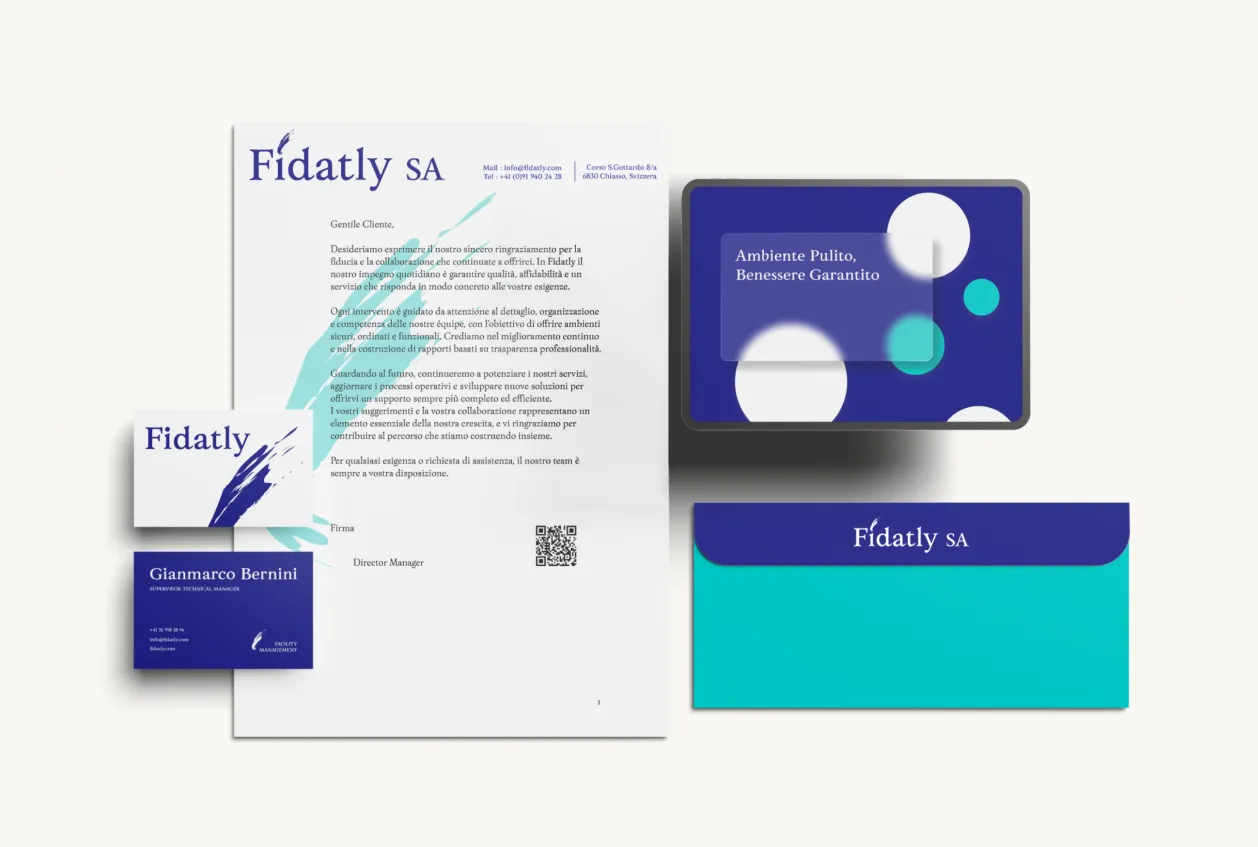
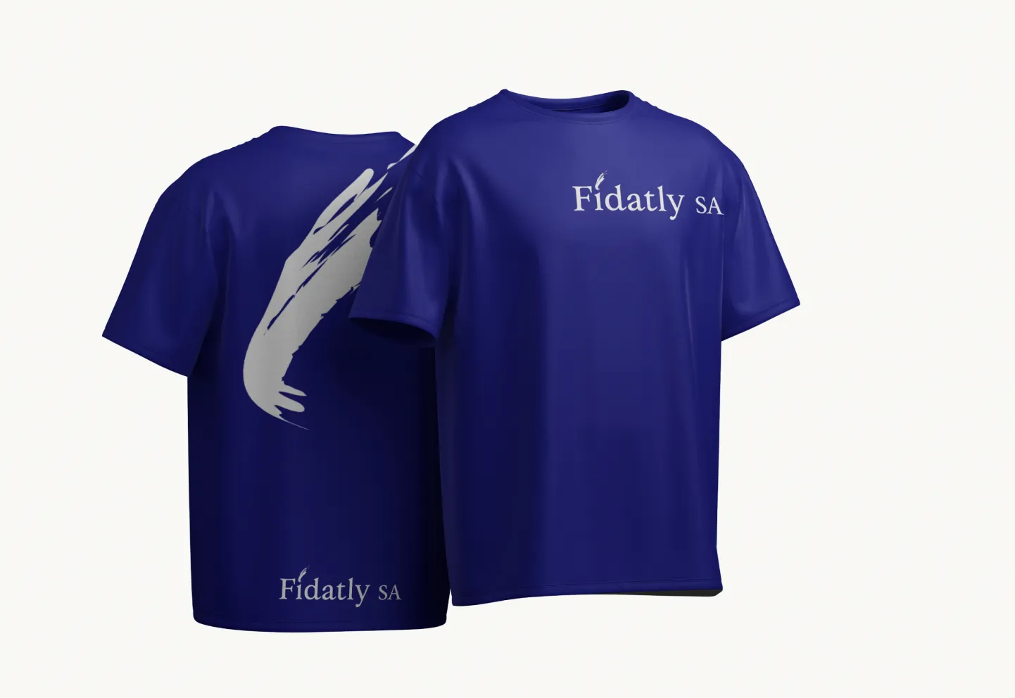
The swoosh in the logo, already part of Fidatly's DNA, stayed, and so did the typography: two assets that already worked, joined by a logo construction grid with proportions and spacing. The palette changed: the muddy greys of the old system gave way to a deep midnight blue and a bright blue, and the overall visual tone moved toward a slightly more playful register, bubbles, water cues, breathing room, without losing the seriousness a B2B service requires. The new identity was applied to the corporate materials: letterhead, business card, envelope, t-shirt, notebook. The site was rebuilt across six areas, facility management, sectors served, about us, sustainability, contacts, references, with UI and UX redesigned in line with the new palette and the pages structured to guide the visitor from discovery to quote request. Two areas carry particular weight: sustainability is a positioning choice, because in the cleaning services market environmental attention has become a real selection criterion for B2B clients; references gives voice to existing clients and builds the layer of social proof that counts when what you sell is trust. SEO was set from the start on local and cross-border keywords: cleaning services Ticino, facility management Chiasso, impresa di pulizie Italia nord. No multilingual site was built: between Ticino and northern Italy Italian covers both markets, and SEO was calibrated instead on specific geographic keywords to intercept searches from both sides of the border.
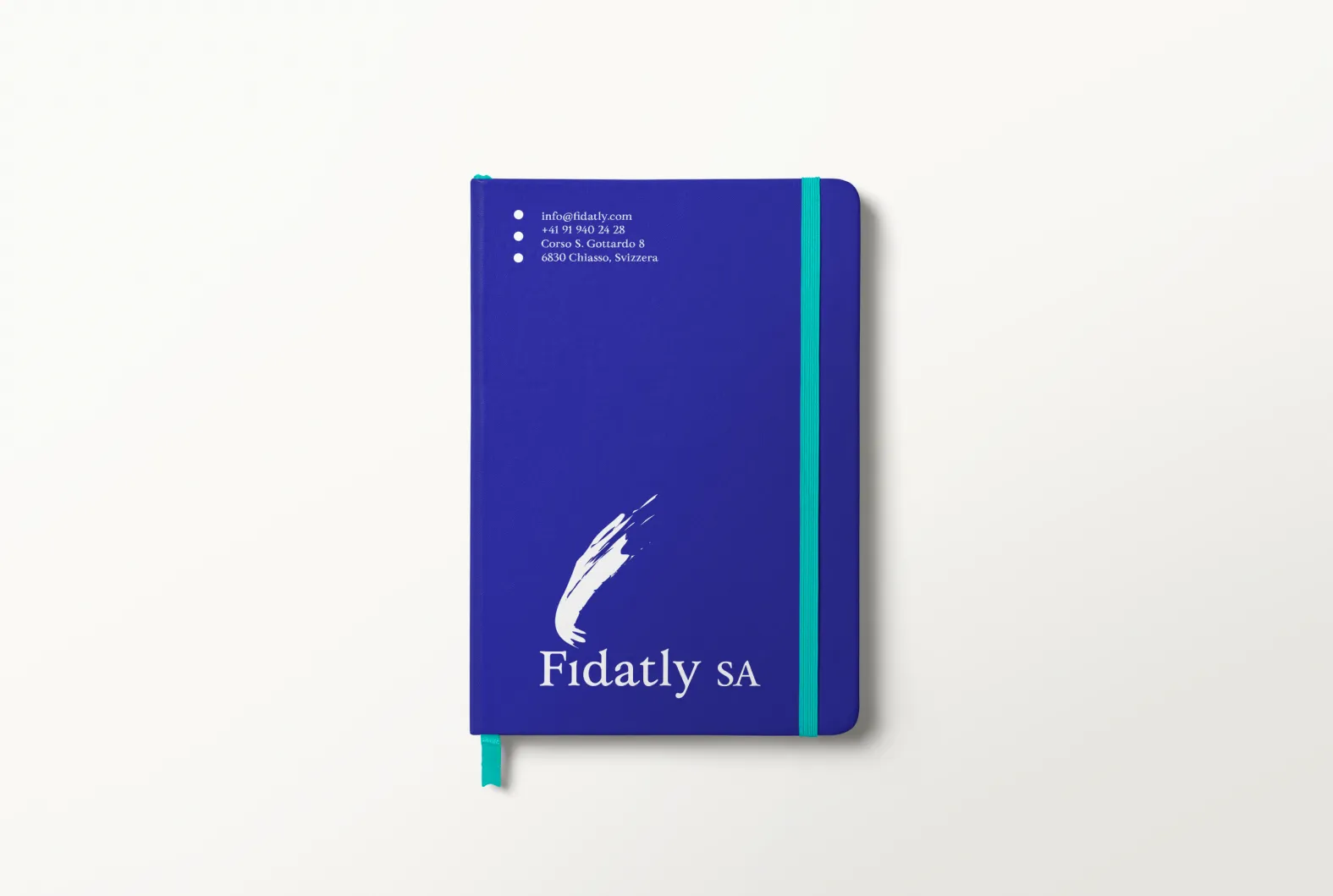
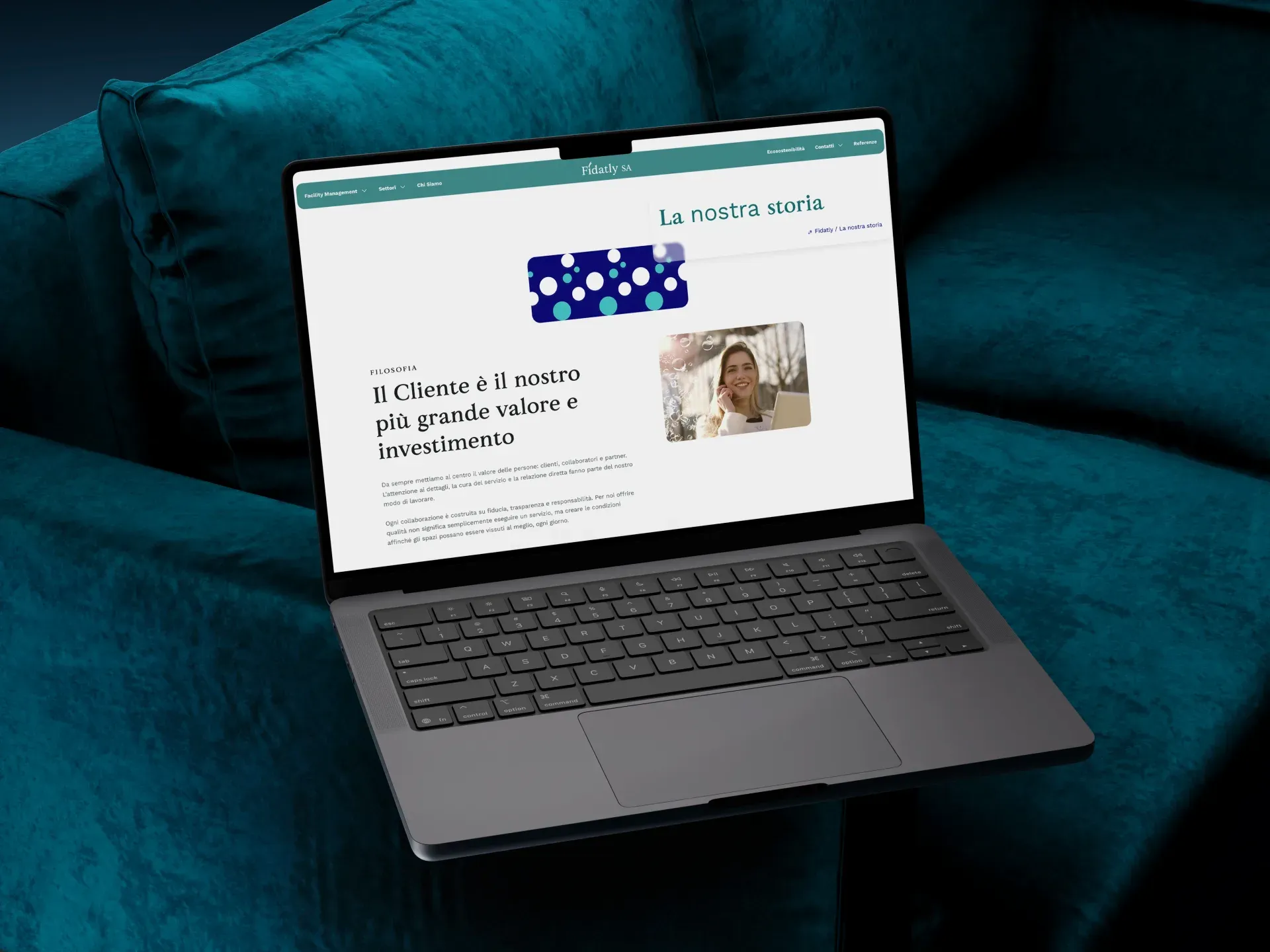
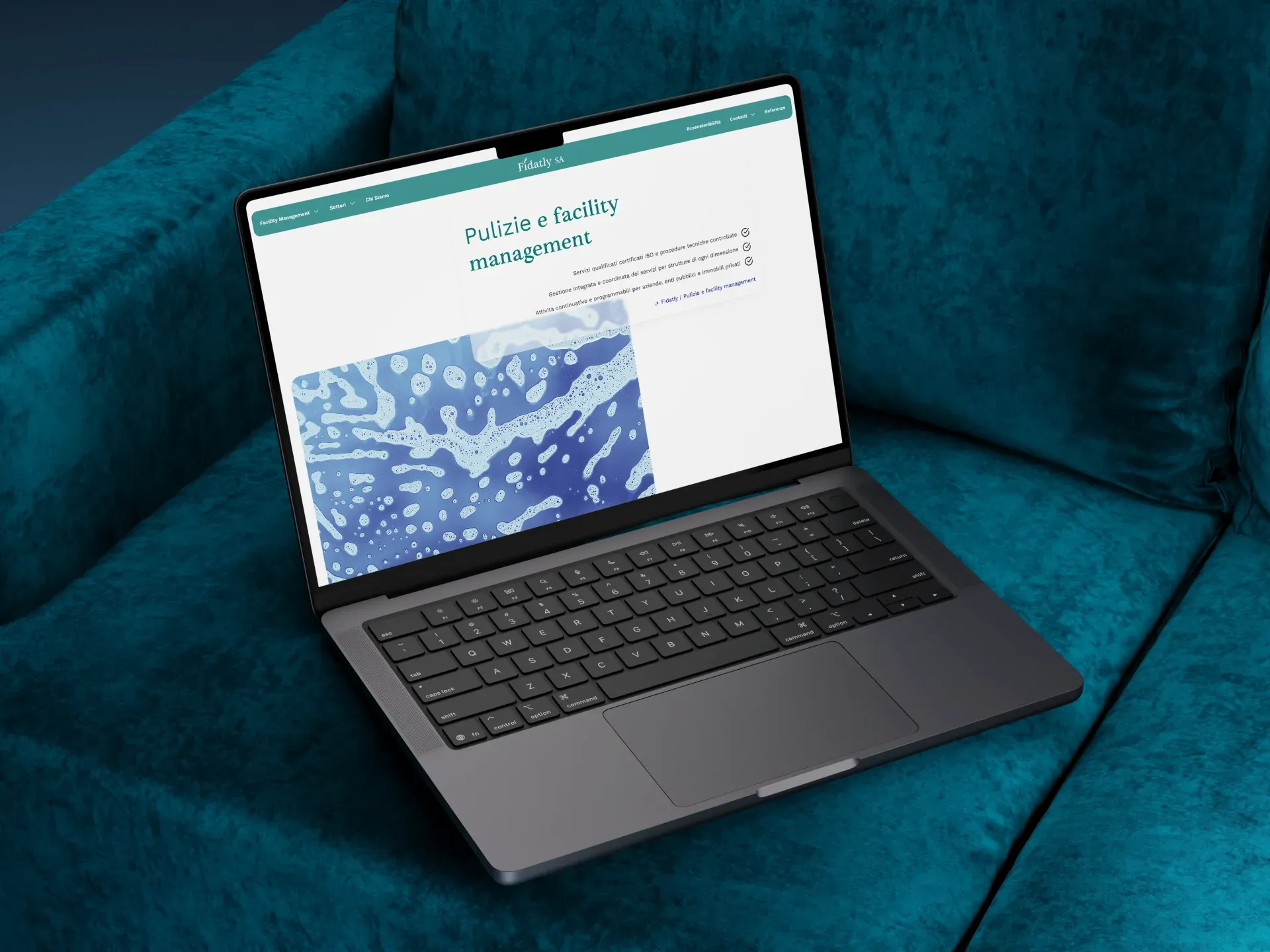
A service selling cleanliness can't show up with a site that looks dusty. The right colour, sometimes, does half the work.
Outsmart Team
Online, with the identity applied.
The site is online at fidatly.com and the corporate materials follow the new identity.
The project in numbers
01When is a soft restyling better than a full rebrand?
When the brand has elements that work and others that no longer communicate. For Fidatly the logo, a recognisable swoosh, was an asset: changing it would have broken continuity. The palette, however, was the real problem, and redesigning it refreshed the identity without wiping it clean.
02Why change the colours of a cleaning services brand?
Because colours are the first vehicle of perception of the service. The muddy greys communicated the exact opposite of what Fidatly sells. The new midnight-blue and bright-blue palette introduces freshness, trust, cleanliness, a colour system coherent with the real experience of the service.
03What does redesigning the site of a facility management company include?
For Fidatly we defined a six-area architecture (facility management, sectors, about us, sustainability, contacts, references), redesigned UI and UX consistent with the new palette, set up SEO on local and cross-border keywords and structured the pages to guide the visitor from discovery to quote request.
04Does a company working cross-border Switzerland-Italy need a multilingual site?
Not necessarily. Fidatly operates between Ticino and northern Italy, where Italian covers both markets: a multilingual site wouldn't have added real value. SEO was instead calibrated on specific geographic keywords to intercept searches from both sides of the border.
See the project live