Tertianum AG — Graphic & Communication Design
Print materials that accompany guests and families with the warmth they need.
- Client
- Tertianum, Residenza Chiasso
- Sector
- Healthcare & Hospitality · Senior Living
- Market
- CH Svizzera
- Year
- 2026
- Services
- Graphic & Communication DesignBrand Design & Corporate Identity
- Website
- tertianum.ch/it
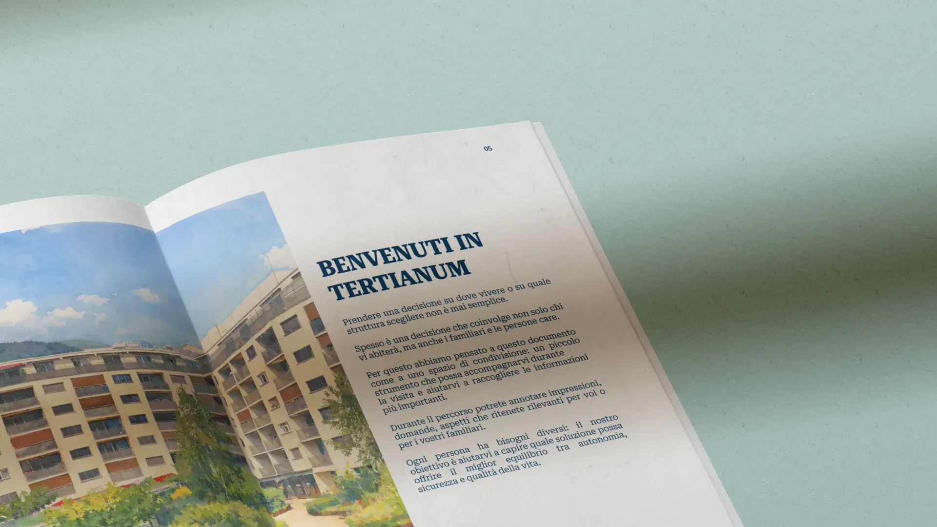
Editorial and print project for Tertianum Chiasso, a residence within Switzerland's leading senior living group: a 50-page visit companion brochure and a series of 5 A3 posters for the 2026 events. Materials designed for an over-70 audience and their families, with generous typography, authentic photography and an enveloping tone, delivered in one month.
A visit companion, not a brochure.
Tertianum is one of the reference groups for senior living in Switzerland, with residences for the elderly spread across the whole of Ticino. The Chiasso location came with a precise need: the printed materials used during visits, that moment when a potential guest and their family first step inside the residence and decide whether to trust it, did not convey the residence's path of care and welcome. The design existed but didn't envelop: what was missing was the warm, reassuring detail, and in this sector a brochure isn't a promotional object but a visit companion, something families take home and look at again in the evening, sitting at the table. Same need on the 2026 events front: posters able to speak to an over-70 audience and to tell the story of the residence's social moments while staying consistent with the group's brand.
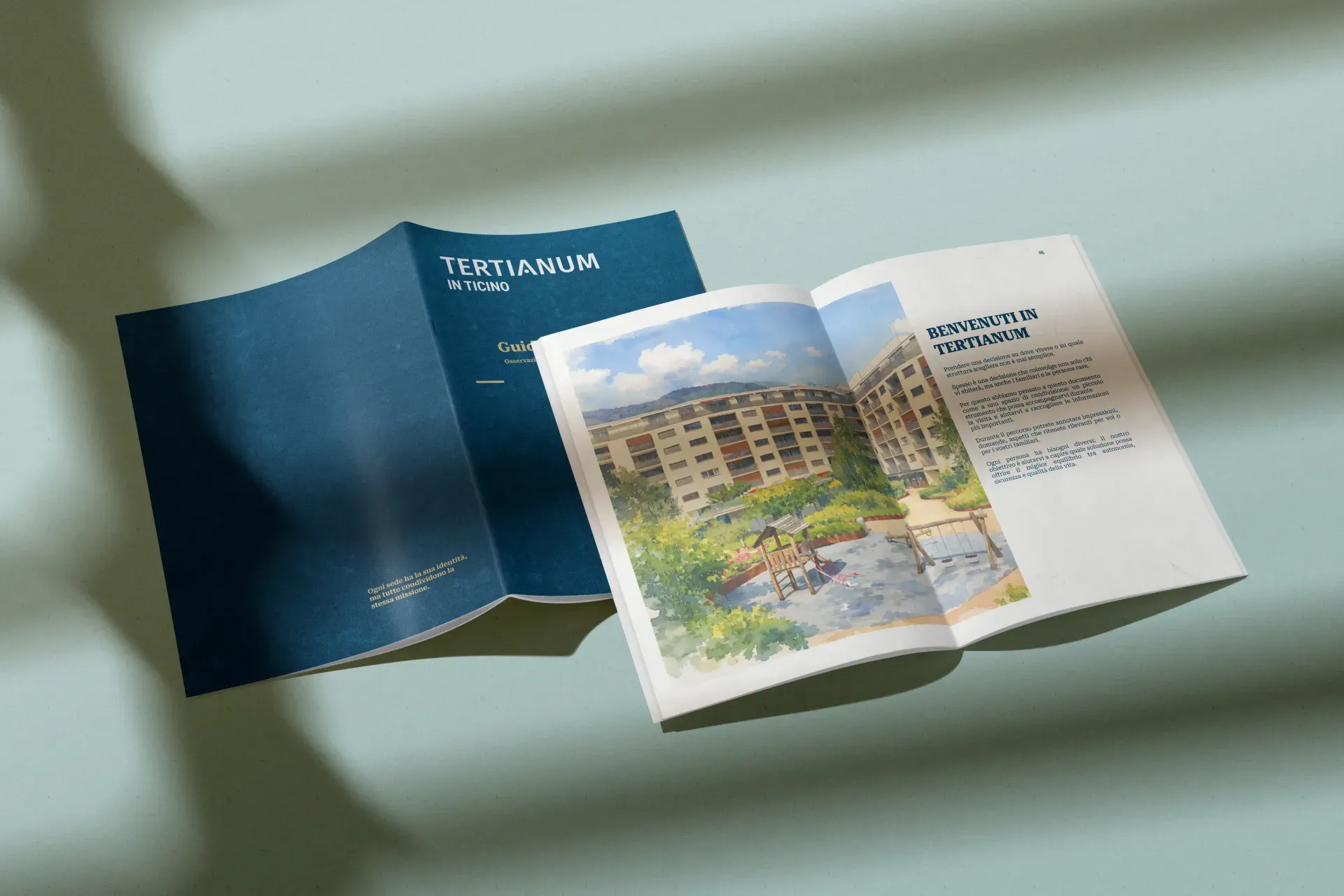
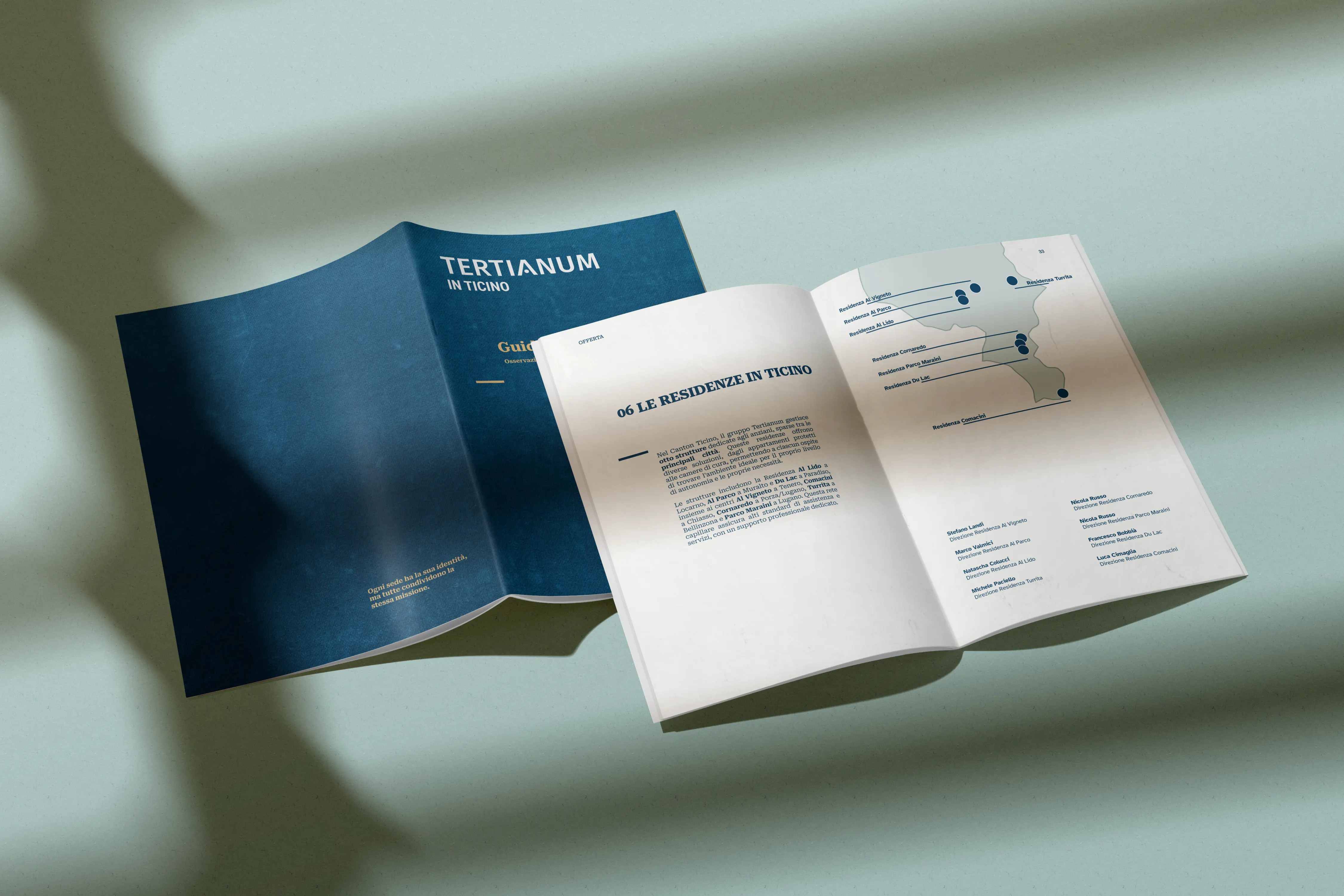
Fifty pages, five posters, one criterion.
The brochure is a 50-page A4 volume with high-quality print: the Tertianum group, the care philosophy, the typical day, the facilities available, the tour of the Chiasso residence, a location section with practical directions for getting there, the price list integrated and legible, medical services and visiting arrangements carrying the technical language they require, explained gracefully, and FAQs built around the questions families actually ask during the visit. Every typographic choice is calibrated on an over-70 reader: enlarged body text, clean typographic hierarchies, generous leading, high text-to-background contrast, ample margins and generous images that let the content breathe. The Tertianum brand palette declined in warm combinations, authentic photography with real elderly people in real residence moments, direct language to talk about care services, daily rhythms and shared life. On the events front, five A3 posters, four dedicated to individual social events plus one annual calendar, held together by a custom modular template with a recognisable structure, each with its own dedicated content and image, clean composition and generous white space following Swiss design principles, typography sized for reading at a distance and for guests with reduced vision.
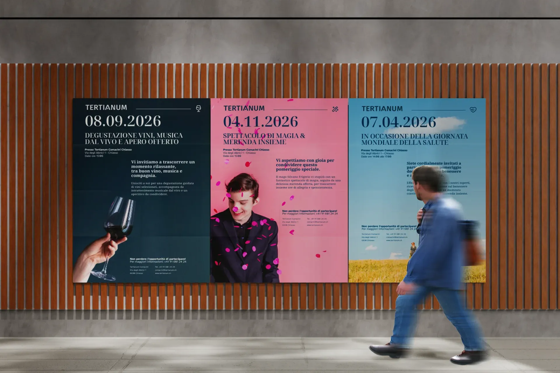
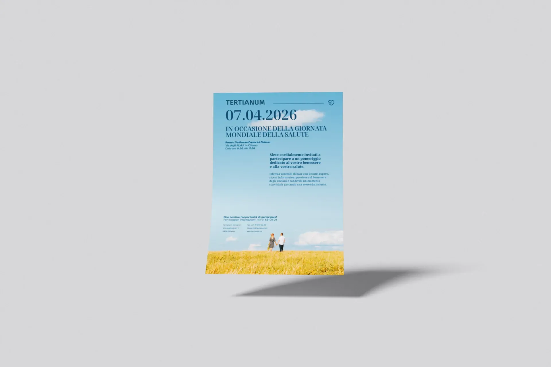
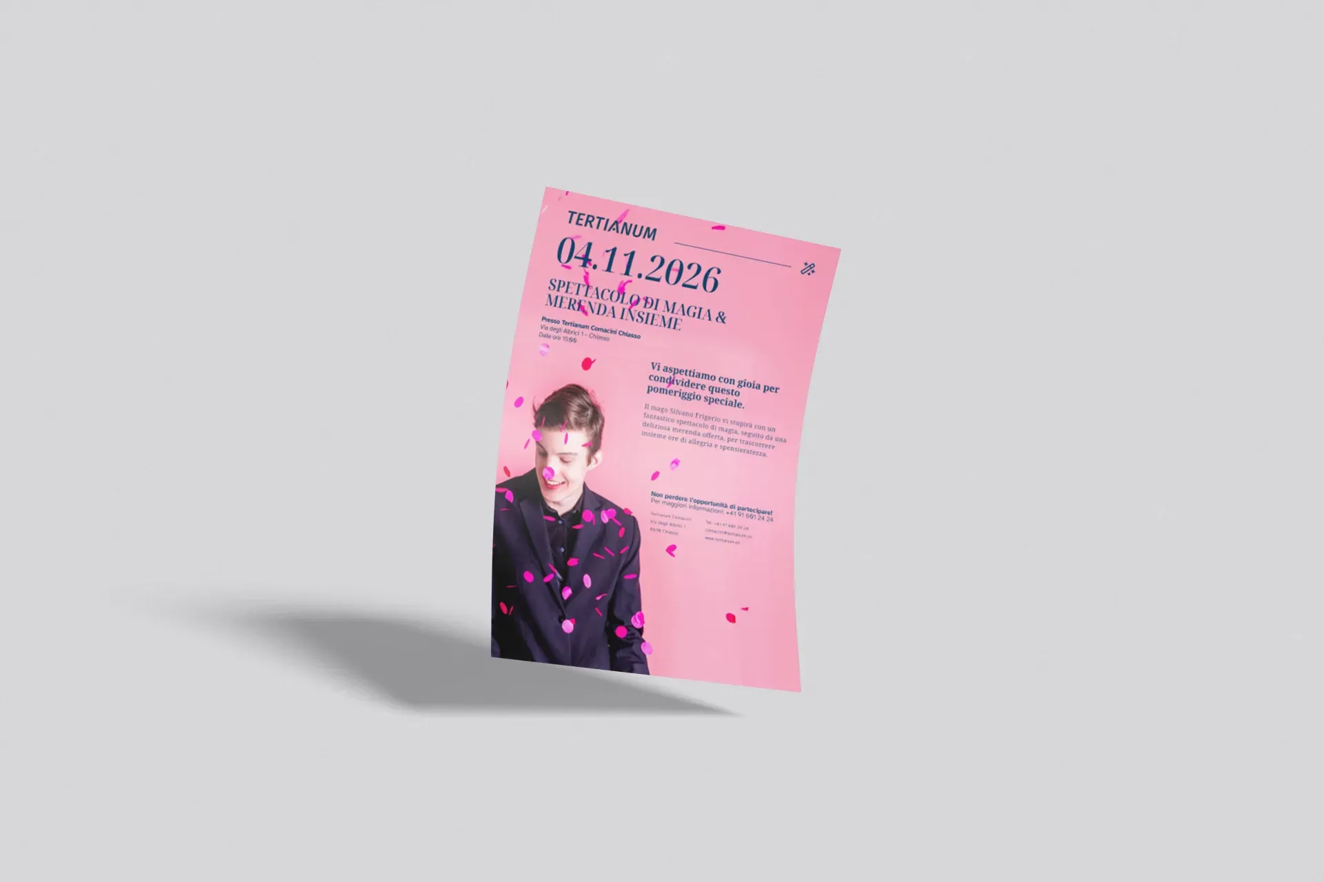
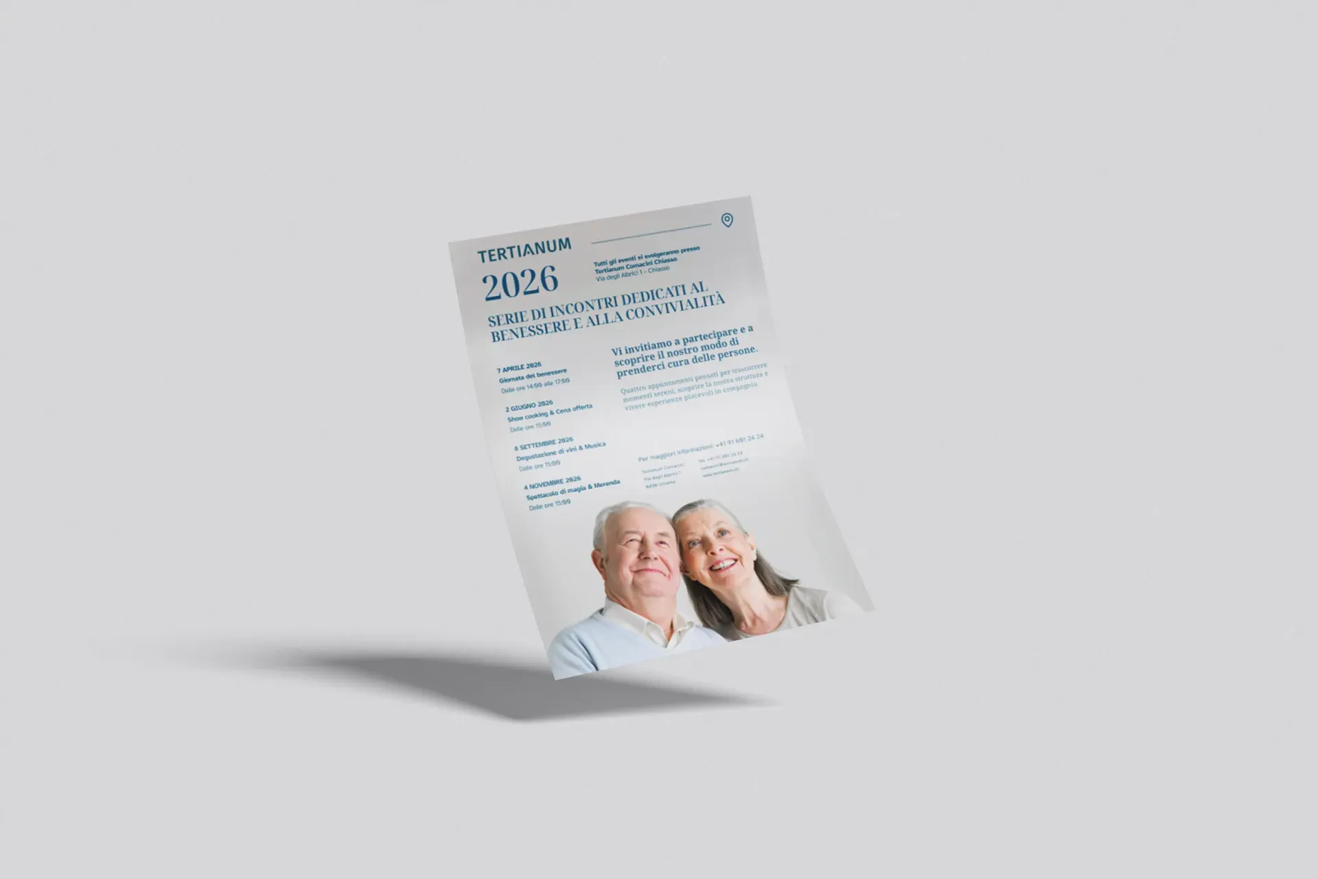
Materials that accompany the visit with clarity and warmth, turning a delicate moment into a reassuring experience from the very first page.
Outsmart Team
Delivered by mid-February 2026.
Brochure and posters were delivered in about a month, from mid-January to mid-February 2026: 50 A4 pages and five A3 posters, same palette, same focus on legibility, same voice.
The project in numbers
01Why is a print brochure still useful for a senior residence in 2026?
Because the target audience, over-70 guests and their families, experiences the visit as a physical and shared moment. A brochure is leafed through together, annotated, taken home. Digital complements but doesn't replace. For Tertianum Chiasso we designed a 50-page volume specifically conceived as a visit companion.
02How do you design printed material for an elderly audience?
Starting with legibility: generous fonts, high contrast, wide leading, clear hierarchies. And then with tone: simple words, real images, a predictable structure that reassures. Inclusive design isn't a creative constraint, it's an opportunity to make better projects for everyone.
03How long does an editorial project like the Tertianum brochure take?
The 50-page brochure and the 5 event posters for Tertianum Chiasso were delivered in about a month. A timeline we deliberately balanced between operational efficiency and attention to detail: no shortcuts on typography, photography or revisions, but a structured workflow that respects the client's needs.
Find out more about the client